Quick context

โ“ Why

  • Creating Aha! moment in the product
  • Realisation, Adoption & Retention

๐Ÿ” What

  • First time user experience
  • Day 0-2 and Day N experiences

๐Ÿ‘ฅ Whom

  • IT security Admins / Virtual infra admins
    • Trial user / first time users
    • Users exploring advance features

๐Ÿ›  How

  • Frame work for onboarding
  • Order of unfolding, Onboarding flows
  • UI components

๐Ÿ’ป Product

Flow Security Central

Takes care of security posture management for cloud resources

  • Compliance status
  • Creating custom audits
  • Security planning
  • Inventory view
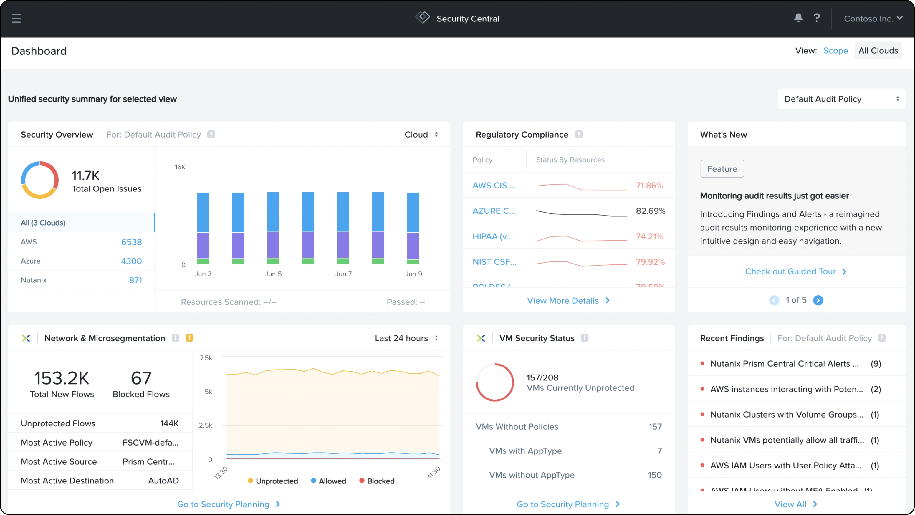
Security Central dashboard screenshot (Security Overview, Regulatory Compliance, Network & Microsegmentation, VM Security Status, Recent Findings panels)

Why to do this?

๐Ÿ“‰Handling initial user drop of rate.

๐ŸšฉExisting onboarding experience is not up-to the mark

๐ŸŒŸAddressing relatively new stream of product in Nutanix

๐Ÿ’ธHow to present the value of product with or without data

๐Ÿง‘โ€๐Ÿ’ป About User & Needs

๐Ÿ” Insights are from user research. for more details Go to my process

๐Ÿ‘ค Users

๐Ÿง‘
  • IT Security Admins Or
  • Virtual infrastructure Admins
  • Name: Sanjay  |  Age: 35
  • Qualification: Security analyst

๐Ÿ”ฅ Qualities

  • Tech-savvy & detail-oriented
  • Multi-dashboard switcher
  • Compliance & audit focused
  • Security-first mindset
  • Hybrid cloud operator
  • Prefers actionable insights

User types

Users exploring product without any cloud resource

๐Ÿ”‘ Needs to address

  • Requirement for onboarding cloud resources
  • How to show value of product with dummy data
  • Motivate users to onboard their cloud resource
Users with cloud resource ready to Upload

๐Ÿ”‘ Needs to address

  • Requirement for onboarding cloud resources & How to onboard cloud resource
  • Where to go next, after cloud resource linking
  • Handling waiting time of onboarded resources
  • How to educate the product
  • Future directions
Users exploring some features on Nth day

๐Ÿ”‘ Needs to address

  • Discoverability of new addition
  • Handling long tours
  • Discovering in between steps in feature

Solution

I will explain the solution in 3 parts

1. Order in which we show the features to user

2. Required UI components in the onboarding

3. Full onboarding flow for users with or without data, & advance user

Solution 1: Determining the order of unfolding, through value analysis

Value analysis

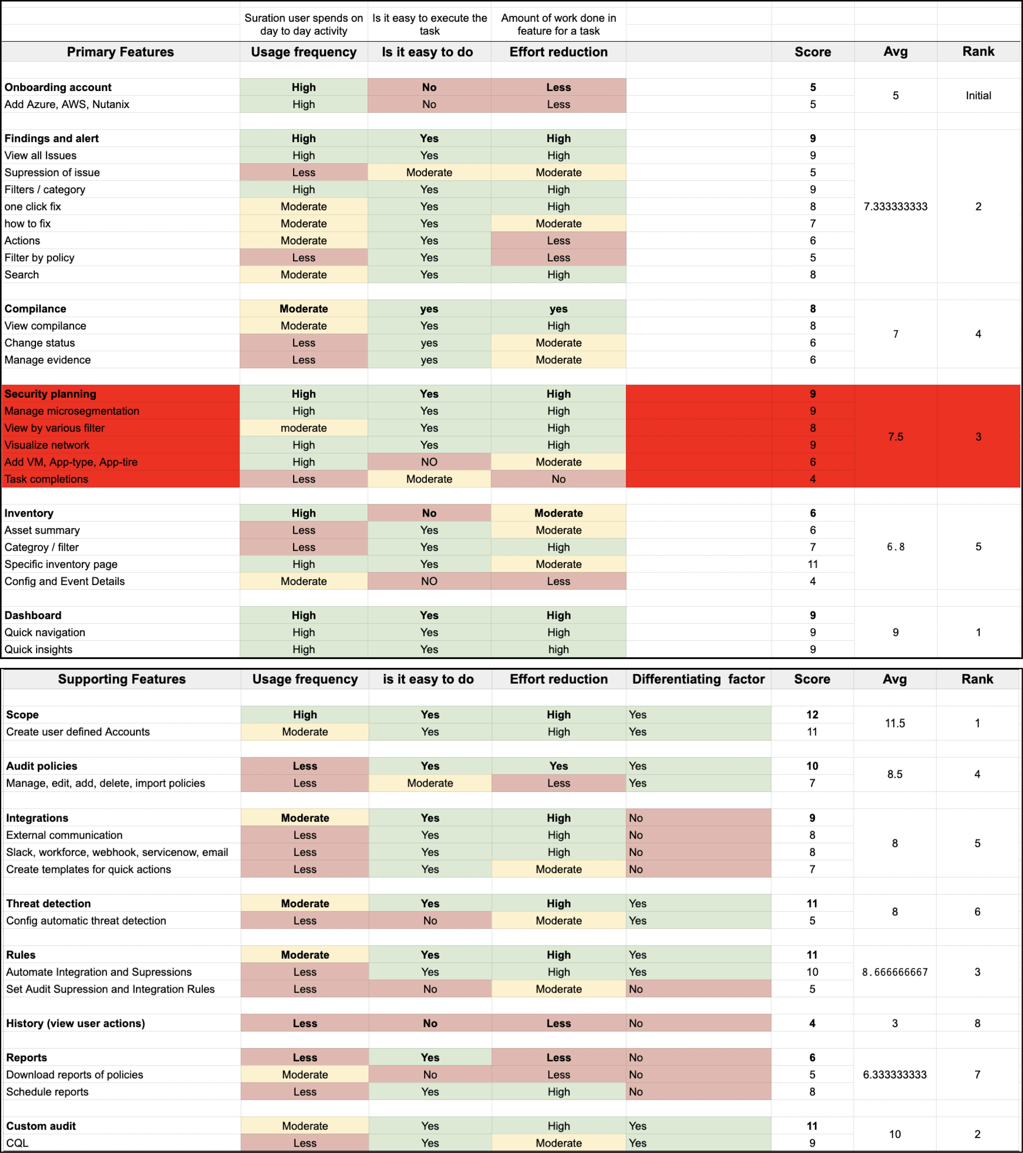
This is to determine the order of unfolding of each feature in value based onboarding. Came up with three main deciding criteria to rank the features.

Similarly its done for all supporting features also.

Needs solved

Optimal order of revealing the feature with with user can gain maximum value

Ease of task execution

Effort reduction to user

Usage frequency

This is to determine the order of unfolding of each feature in value based onboarding. Came up with three main deciding criteria to rank the features using weighted matrix.

Value analysis scoring table (Primary Features: Onboarding account, Findings and alert, Compliance, Security planning, Inventory, Dashboard; Supporting Features: Scope, Audit poโ€ฆ

For Primary Features

  1. How to Onboarding Cloud Resource
  2. Explain Dashboard
  3. Explain Findings & Alets
  4. Explain Inventory
  5. Explain Compliance
  6. Explain Security Planning

For Secondary Features (optional)

  1. Scope
  2. Custom Audits
  3. Rules
  4. Audit policy
  5. Intergrations
  6. Thread detection
  7. Reports
  8. History

Solution 2: All Supporting UI Components

Needs solved

Basic information popup tooltips. With various variations like milestone completion, visual guide on action etc.

Adhering to existing Nutanix design system

Tooltip & milestone popup mockups (hover info, "Product tour complete", "Feature tour complete" with Done/More Help buttons)

Needs solved

General guided tour pop-up showing the progress very clearly, in visual form as well as numeric, which was not there previously

"Tool tip" guided-tour popups with progress bar (1 of 6 / 2 of 6, Skip/Back/Next)

Needs solved

Dynamic guided tour where you can skip in between tours and explore specific things you needed in long tours.

Also give you visibility of new features

Sequential guided-tour popups with left sidebar nav ("All Issues" 1 of 12, "Scope" 2 of 12, "One click fix" 8 of 12)

Solution 3: Onboarding flow experience

Before

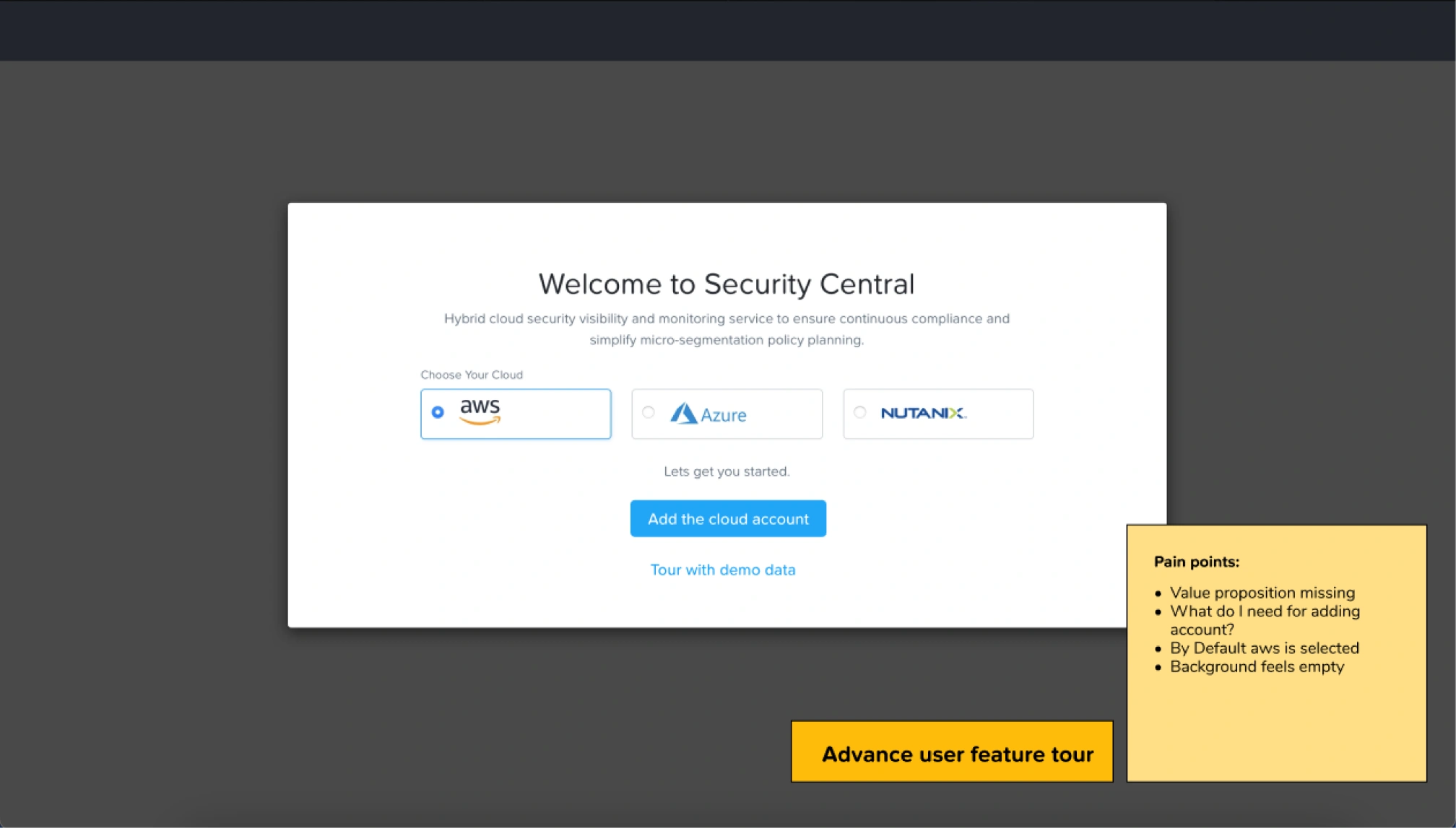
Old "Welcome to Security Central" screen with sticky-note pain points ("Value proposition missing", "What do I need for adding cloud account?", "By Default aws is selected")

After

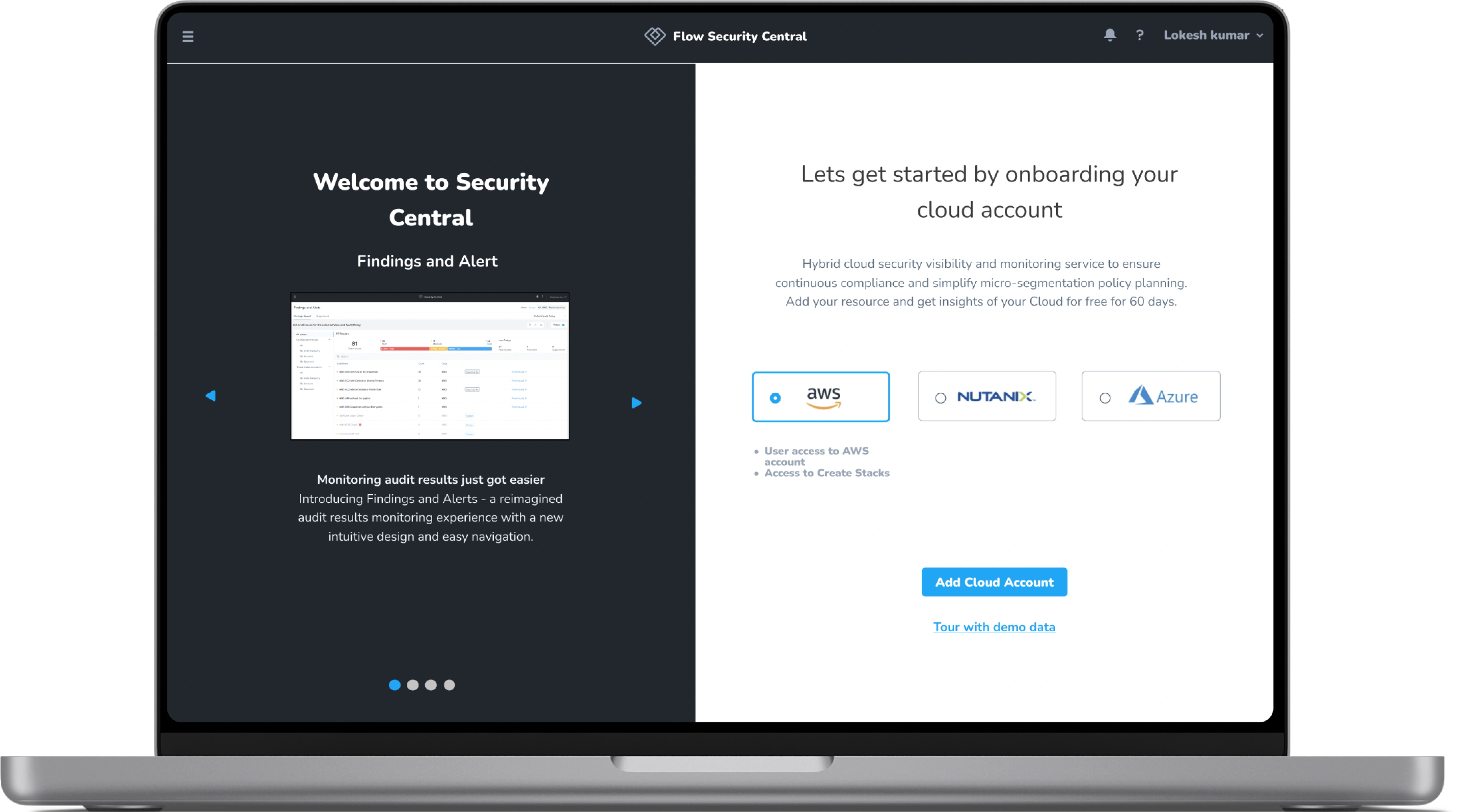
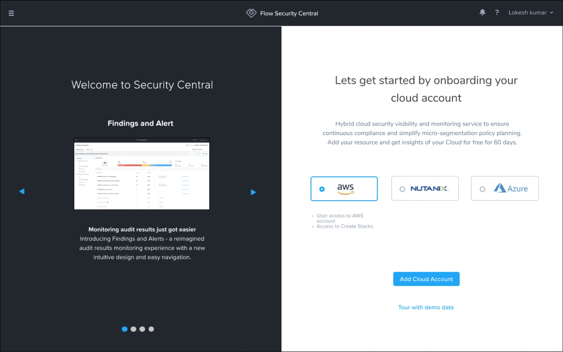
Redesigned "Welcome to Security Central" + "Lets get started by onboarding your cloud account" screen

Before

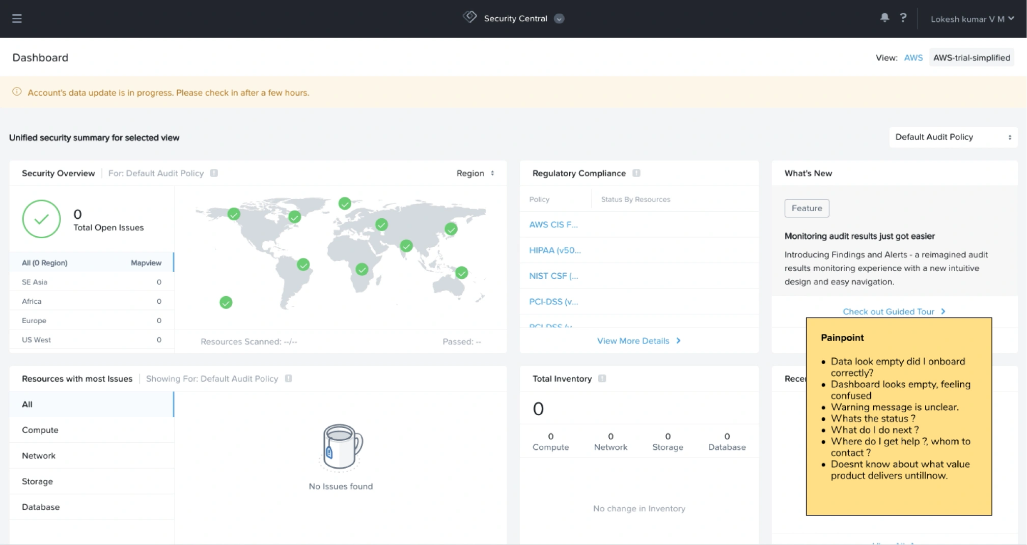
Old dashboard screenshot

After

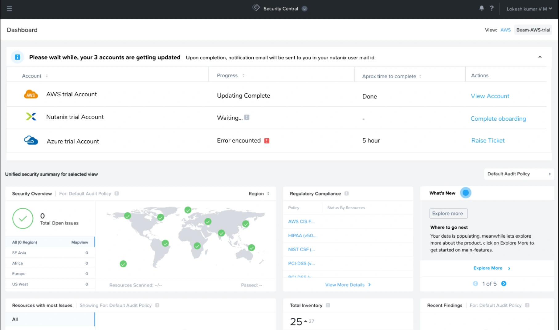
New dashboard with collapsible onboarding pane

New collapsable dashboard pane

For Handling onboarded cloud resource. When ever user onboards any cloud resource this component will show up in dashboard in collapsed state.

Annotated dashboard screenshot: "Please wait while your 3 accounts are getting updated" banner + AWS/Nutanix/Azure trial account status table (Updating Complete / Error encounteโ€ฆ

Old first time experience  โ†“

Redesigned new experience, solving all the above mentioned needs.

Research

Research mindmap (Primary research: User work flow by walk me video analysis, Understanding user by PM & SME interactions ยท Secondary Research: Product research โ€” Before comโ€ฆ

Primary research

Studying user flows

From analysis of the user flows via walk me videos and PM & SME interaction.

2 ๐Ÿ‘ค SMEs 2 ๐Ÿ‘ค PM & Manager 6 1hr walk me videos

Each features detailed flows were also studies

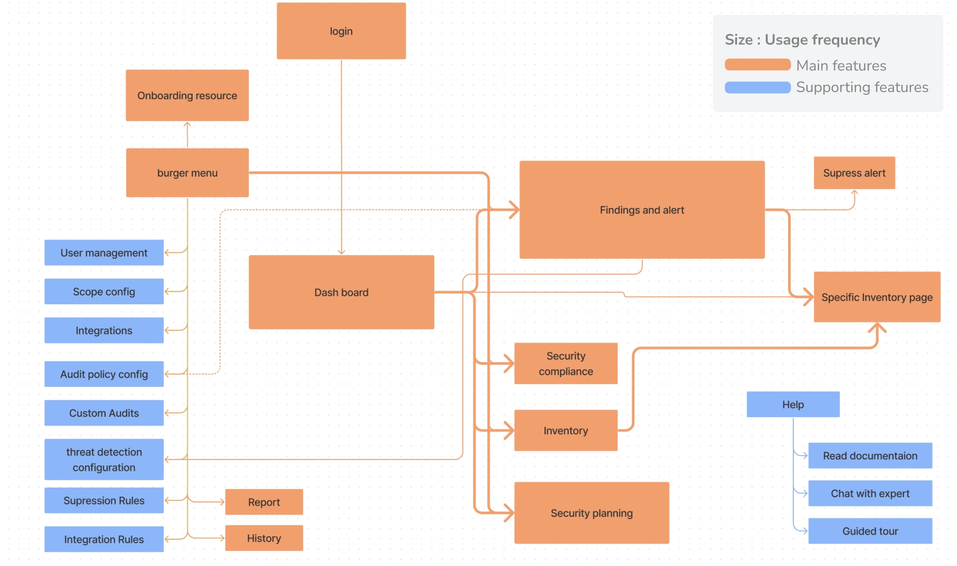
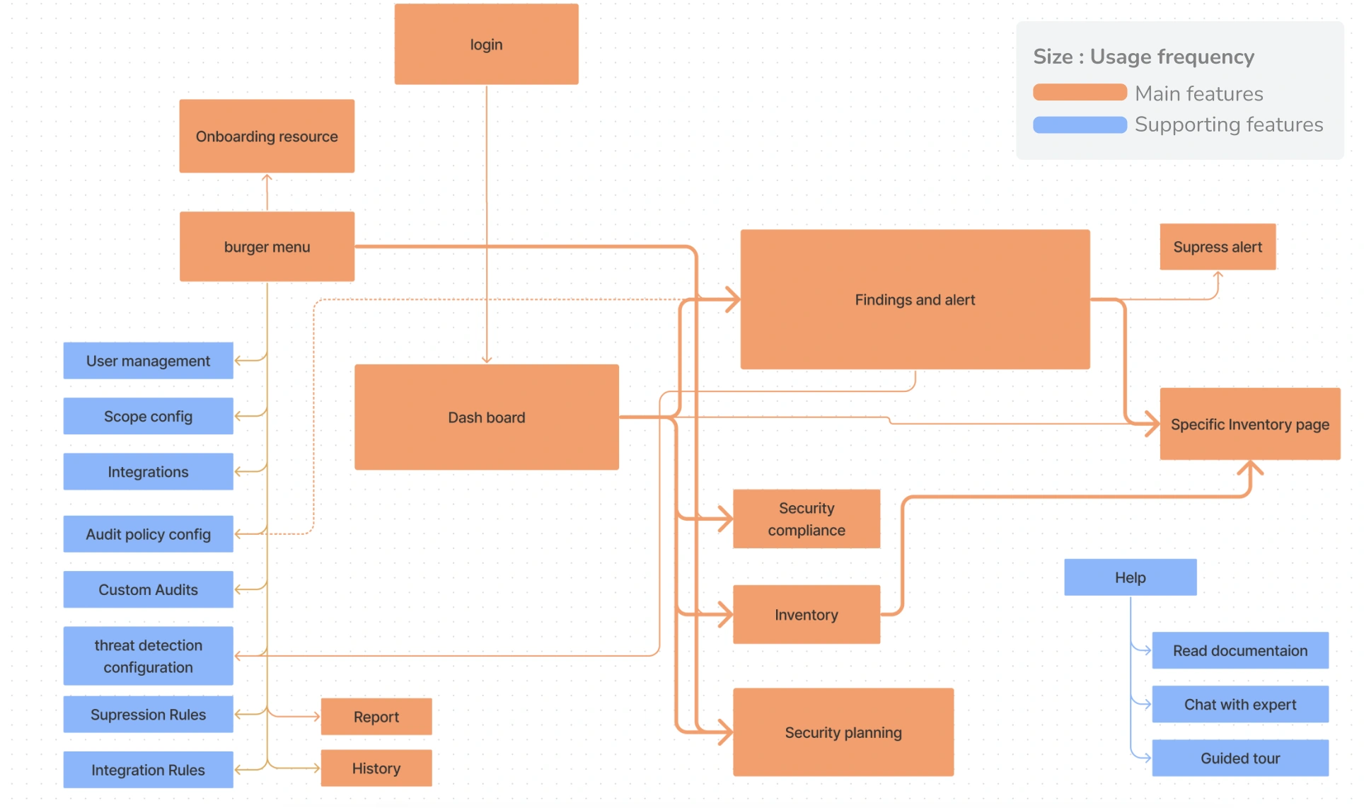
User flow map (login โ†’ onboarding resource โ†’ burger menu โ†’ dashboard โ†’ findings and alert โ†’ specific inventory page, plus supporting features sidebar & help links). Legend: โ€ฆ

Pre-Product experience Research

Pre onboarding Competitor analysis

Based on the various elements they have in the product page in terms of

  • Product video
  • Screen demos
  • Trial version
  • Live demo
  • Signup
  • Supporting cloud.
Competitor comparison table (Nutaix, Prisma cloud, Cloud checker, Cloud health VM ware, Check point Demo 9 Cloud Gaurd โ€” with Product screenshot, Product Video/Screens Demos/Triโ€ฆ

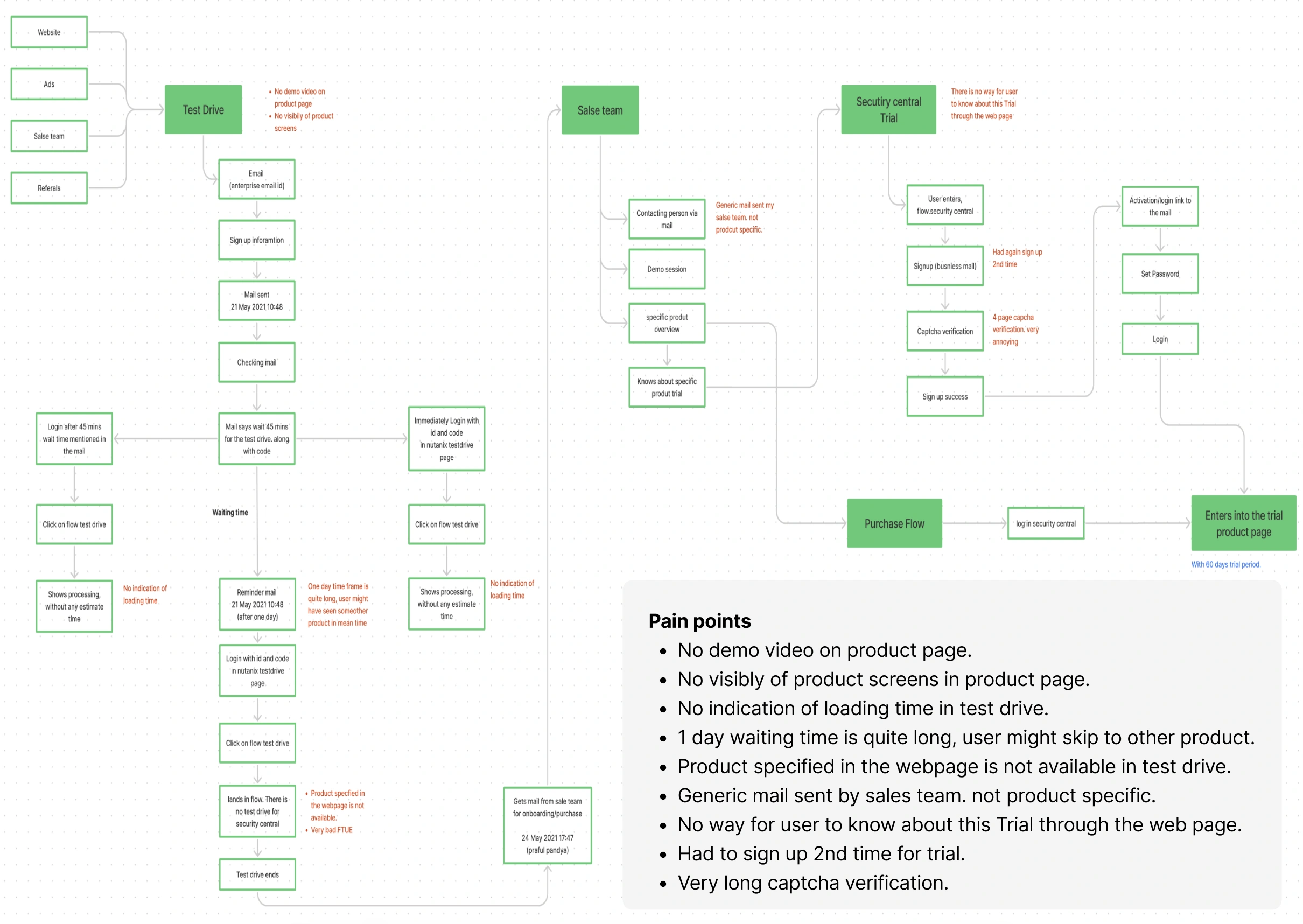
Pain points in experience before entering into the product

Pre-product journey flowchart (Website/Ads/Sales team/Referrals โ†’ Test Drive โ†’ Email sign up โ†’ Mail sent โ†’ wait time branches โ†’ Security central Trial signup/captcha โ†’ Purchase โ€ฆ

Product Reserach

Studying user flows

From analysis of the user flows via walk me videos and PM & SME interaction.

Feature usage flow map (login โ†’ onboarding resource / burger menu โ†’ dashboard โ†’ findings and alert / security compliance / inventory / security planning, plus supporting featureโ€ฆ

Studying Product

Most used and main features are listed on the right side

  • Dashboard
  • Findings and Alert
  • Compliance
  • Inventory
  • Security planning

Less used features are mentioned in the left side

  • Scope
  • Custom Audits
  • Audit policy
  • User management
  • Add accounts
  • Integration rules
  • suppression rules
  • Threat detection
Feature/Task mindmap (Security central login โ†’ Add Accounts / Dash board & burger menu / Setting โ†’ per-feature task breakdown). Legend: Features (blue) / Task (light blue)

Analysing current experience

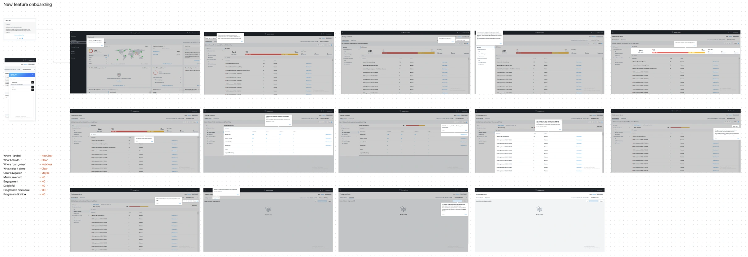
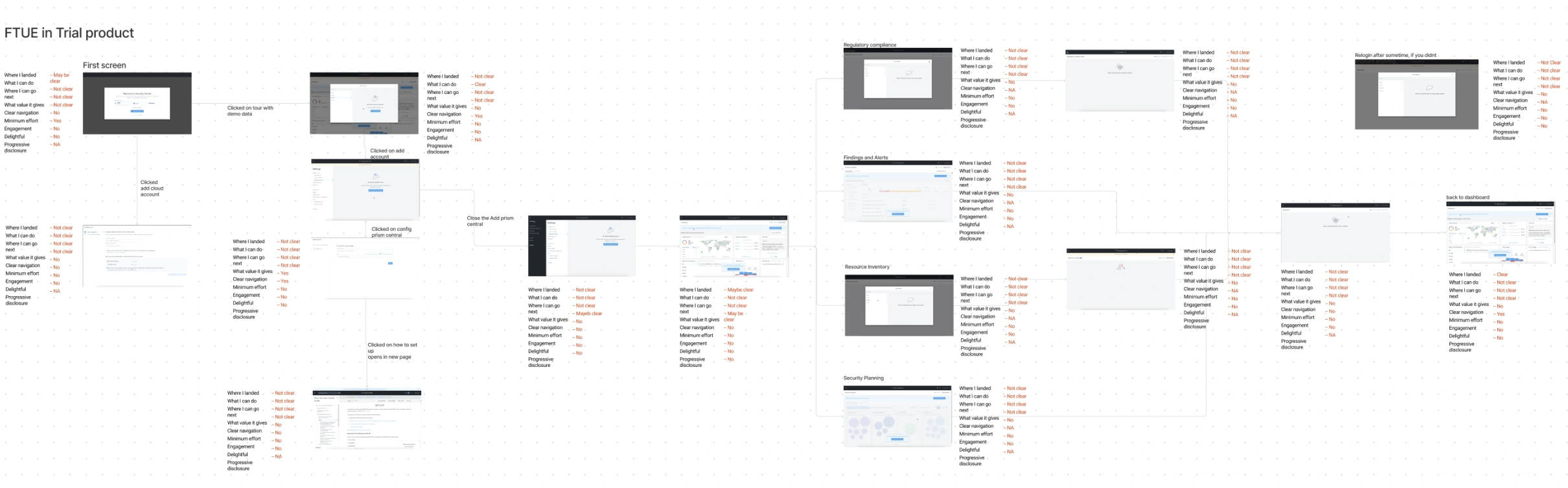
"New feature onboarding" grid of ~15 grayscale UI screen thumbnails showing the existing dashboard flow FTUE in Trial product โ€” annotated flow diagram with screen thumbnails

Pain points in existing first time experience

  • Evaluating each screen based on the Check list prepared.
  • Value proposition is missing in the welcome page.
  • In most of the part “where I landed, and what value it gives” is not clear.
  • No proper flow, all end up in the resource onboarding page.
  • Some pages are blank and doesn't deliver any value.
  • Initially its very difficult to find the dashboard.
  • User has no freedom to explore the product beyond dashboard.
  • No specific feature tour exists.
  • Initial navigation are very difficult.

Pain points in existing advance user experience

  • Initiated from Guided tour option which has poor visibility.
  • Taking full user control, should let them time to explore.
  • No progress indication.
  • Really a long walkthrough (13 steps), user might feel overwhelmed.
  • Use of lengthy text, reduces engagement.
  • Only few walkthroughs has back options.
  • It is very hard to identify skip or close.
  • The ending is very abrupt doesnt lead you anywhere.
  • Flow doesnt deliver the value first.

Competitor Analysis

All frame works talk about 3 things which are strategies, order of unfolding and supporting UI elements

1. Strategies

  • Help
  • Contextual onboarding
  • Progressive Disclosure
  • Assistance based onboarding
  • Degree of user control
  • Documentation and Support

2. Order of unfolding

  • User value based flow
  • Function based flow
  • Feature based flow

3. UI elements

  • Signup
  • Welcome message
  • Product tours
  • Progress bar
  • Checklists
  • Hotspots
  • Action driven tooltip
  • Milestone celebration
  • In app and out app connection
  • Ending message

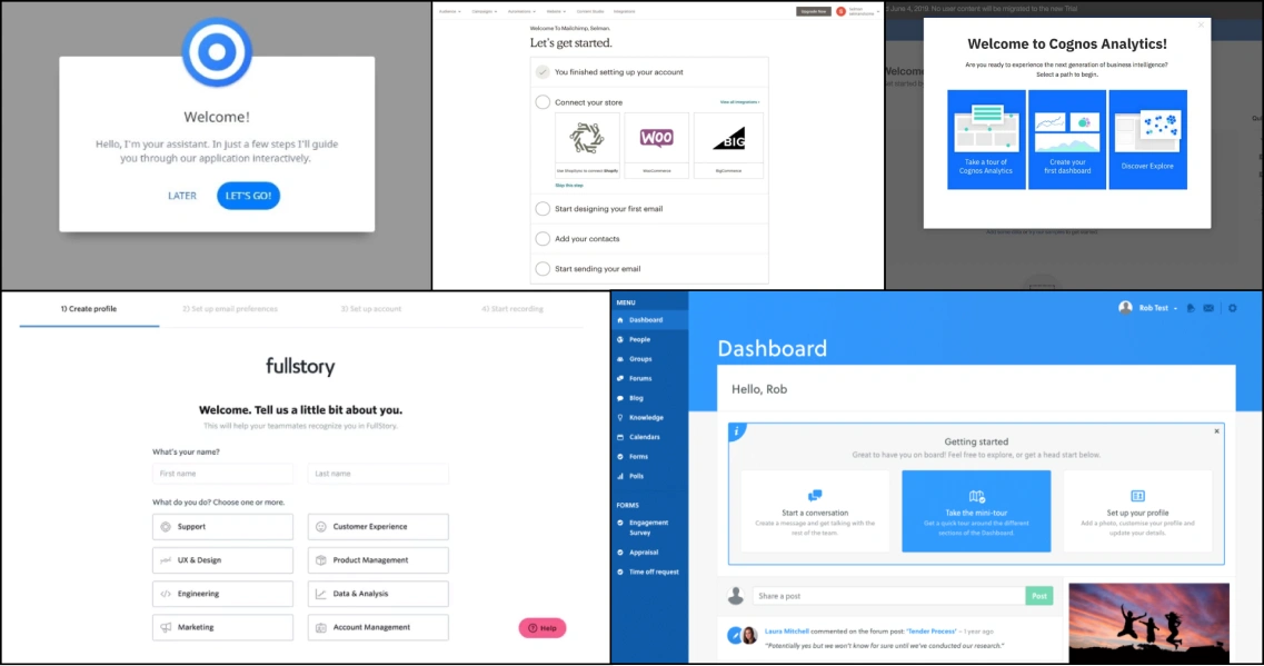
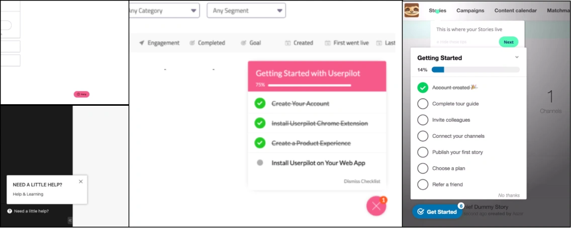
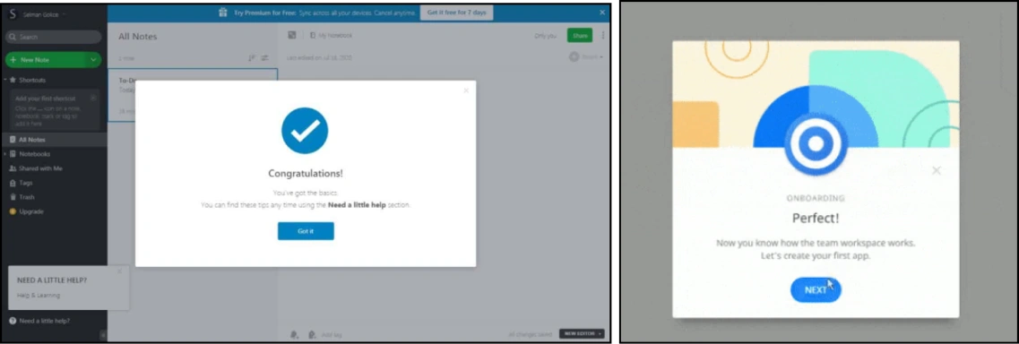
Analysing above mentioned points in competitors. Most of the products selected are mentioned in the articles of best practices of First time user experience

No of product considered for analysis: 16

Enterprise product (8)

  • Robin
  • Ninox
  • Mailchimp
  • IBM cognos
  • Salesflare
  • Productboard
  • User pilot
  • FullStory

Consumer product (4)

  • Grammarly
  • StoryChief
  • Evernote
  • Typefrom

Mixed product (3)

  • Conversion XL
  • Box starter
  • Slack
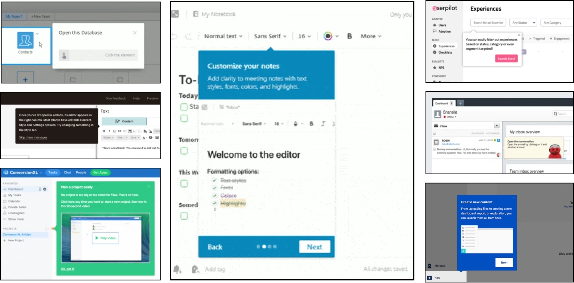
Screenshot grid of all 16 competitor products, annotated "Analysis of best strategies followed in all 16 products"

Competitive Analysis

Bubble-size comparison matrix across 14 competitors (Robin, Ninox, Mailchimp, IBM cognos, Salesflare, Productboard, User pilot, FullStory, Grammarly, StoryChief, Evernote, Typefโ€ฆ

Insights from competitor analysis

Various strategies and frameworks discovered in competitor analysis
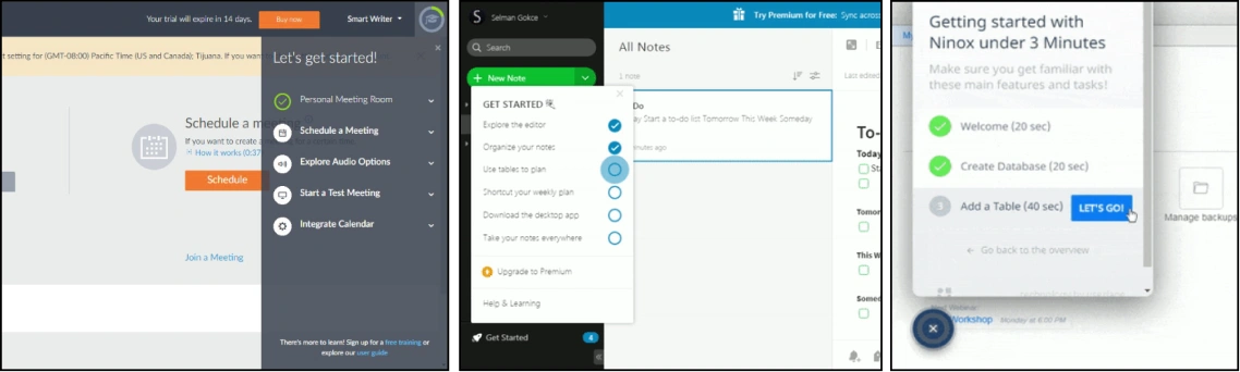
Tour initiation strategies

  • Completely skippable tour?
  • Showing gist/contents of the tour.
  • Mock images to explain the features
  • Use of dashboard frame work

For advance use

  • Access to Help
  • Jump in between tours to a specific point
  • Visibility & learnability of new feature

Attention grabbers

  • Points and label based hotspots (animated)
  • Right color and contrast, matching labels
  • Usage within sub-levels of the product.

Information delivery

  • Context based tool tip (text button, Image /GIF based)
  • Progress indication, back, skip and next controls if needed
  • Compulsory Skip

Encouragement strategies

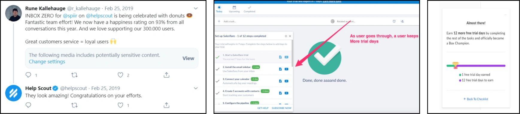
  • Subtle celebrations using image and text increases engagement.
  • Micro-animations in the celebration?
  • Extra trial extension?

Help initiation

  • Easy visibility. Floating icon.
  • Ability to invoke tour whenever needed.
  • Contextual messaging, and Quick access

Ending directions

  • Directing to help and support.
  • A small sum-up
  • Celebration and Where to go Next.

Defining must have

Ideal FTUE frame work

Results of Reserach

  • User need to know what they can do, and show them what to expect.
  • Delivering value as soon as possible, With the minimum user effort.
  • Make things clear, visible, and easy to learn.
  • Improve engagement and encourage the user to investigate the available options.
  • Give the user a reason to come back.

Evaluation check-list for my solution

  • Where I landed
  • What I can do
  • Where I can go next
  • What value it gives
  • Clear navigation
  • Minimum effort
  • Engagement
  • Delightful
  • Progressive disclosure
  • Control to the user
Where am I
Let the user know where they are and leave them in no doubt that they are at the starting point of their explorations.
What user can do
Let the user know, within reason, the things they can do within the product
Where user can go
Once you have conveyed their current location and some of the thing the user is able to do, you must make it apparent to them where they can go next.
Navigation methods
Show users what they can do and where they can go, but if there is no clear, visible, and logical navigation structure the user may be confused to find their desired point
Value first
Users don't care about features, they care about how it will make their lives better. Show them the value they can get.
No explanation
No one has time for trying to understand what the product can offer. Let the user do something instead of instructing them how to do it.
Progressive disclosure
People feel overwhelmed when they get too many options or complex functionality. Give them only a taste of what the product can offer. Let them discover more naturally
No friction
Reduce effort to a minimum by using common patterns, pixel perfect UI and flawless flow. A small detail can make a big difference.
Engagement
Activate your users and show them what they can do next. Keep them engaged so they don't feel bored or pointless.
Trust
Be careful about permissions and sensitive information, especially if people don't recognize brand. Build trust instead of privacy concerns.
Delightful moments
Add any celebration, micro-interaction, funny illustration, animated loader or smart UX copy, to add a little pleasure or unique feel.

User Personas

VI Admins & IT Security Admins

AlexAge: 35 ยท Experience: 10+ years in IT infrastructure and cybersecurity. ยท City: Banglore

Qualities

  • Tech-savvy and detail-oriented, often switching between multiple dashboards.
  • Prefers streamlined tools with actionable insights and automated options.
  • Relies on reports for audits and stakeholder communication.

Goals

  • Ensure compliance with security policies across on-premises and cloud resources.
  • Gain real-time visibility into the organization's security posture.
  • Keeping cloud resources in a good health

Pain points

  • Managing and scaling security for hybrid cloud environments.
  • Identifying and addressing potential vulnerabilities efficiently.
  • Balancing operational efficiency with strict compliance requirements.

Wants

  • Centralized dashboard for managing multi-cloud security.
  • Automated vulnerability detection and remediation.
  • Real-time compliance tracking and easy report generation.
  • Simplified workflows to reduce manual effort and human errors.

Tools / Products

  • Cloud health VMware, Prisma cloud, cloud checker

User need

Major user need

Provide value of product as soon as possible
Handling wait time & error of after linking cloud.
Motivation to onboard cloud resources
Clear navigation, and access to help

For first time use

  • Redesign of end to end user flow
  • Where to go next after cloud resource on boarded
  • Handling waiting time of onboarded resources
  • Let users know about all features
  • How to provide value with dummy data

For advance use

  • Access to Help
  • Jump in between tours to a specific point
  • Visibility & learnability of new feature

Iterations / formulating solution

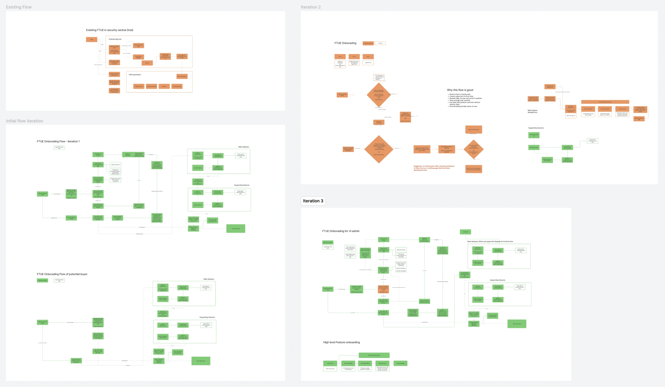
Iteration on obboarding flows

4-panel flow iteration grid (Existing Flow, Version 2, Initial flow iteration, Iteration 3)

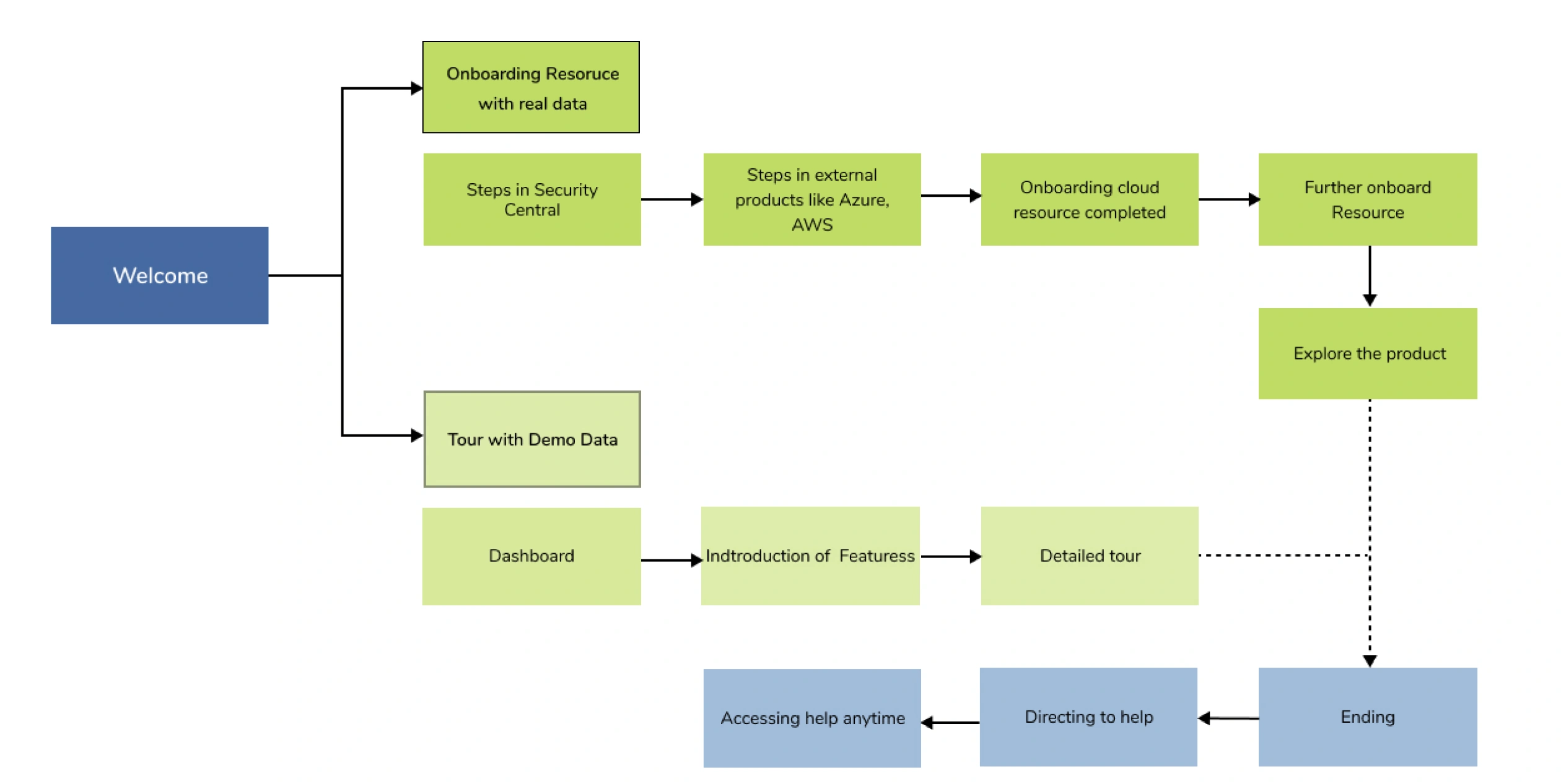
Iteration on obboarding flows

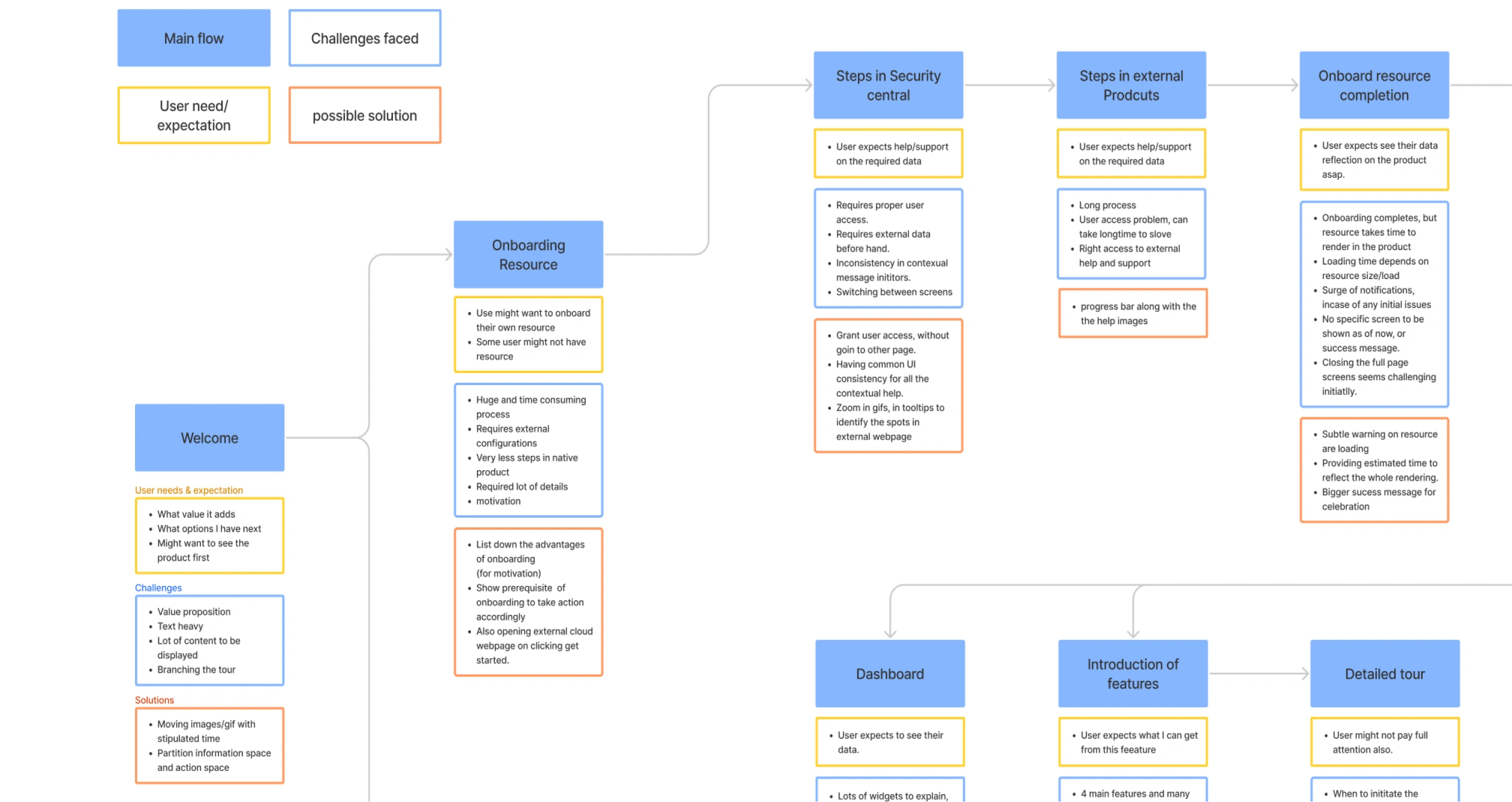
Top-level onboarding flow (Welcome โ†’ Onboarding Resource with real data โ†’ Steps in Security Central โ†’ Steps in external products (Azure/AWS) โ†’ Onboarding cloud resource completeโ€ฆ Detailed iteration diagram with per-node "User need/expectation" (yellow), "Challenges faced" (white), "possible solution" (orange) callouts for Welcome โ†’ Onboarding Resource โ†’ โ€ฆ

Wire framing

Low-fidelity wireframe grid (full onboarding screen set)

Testing Iterations with prototypes

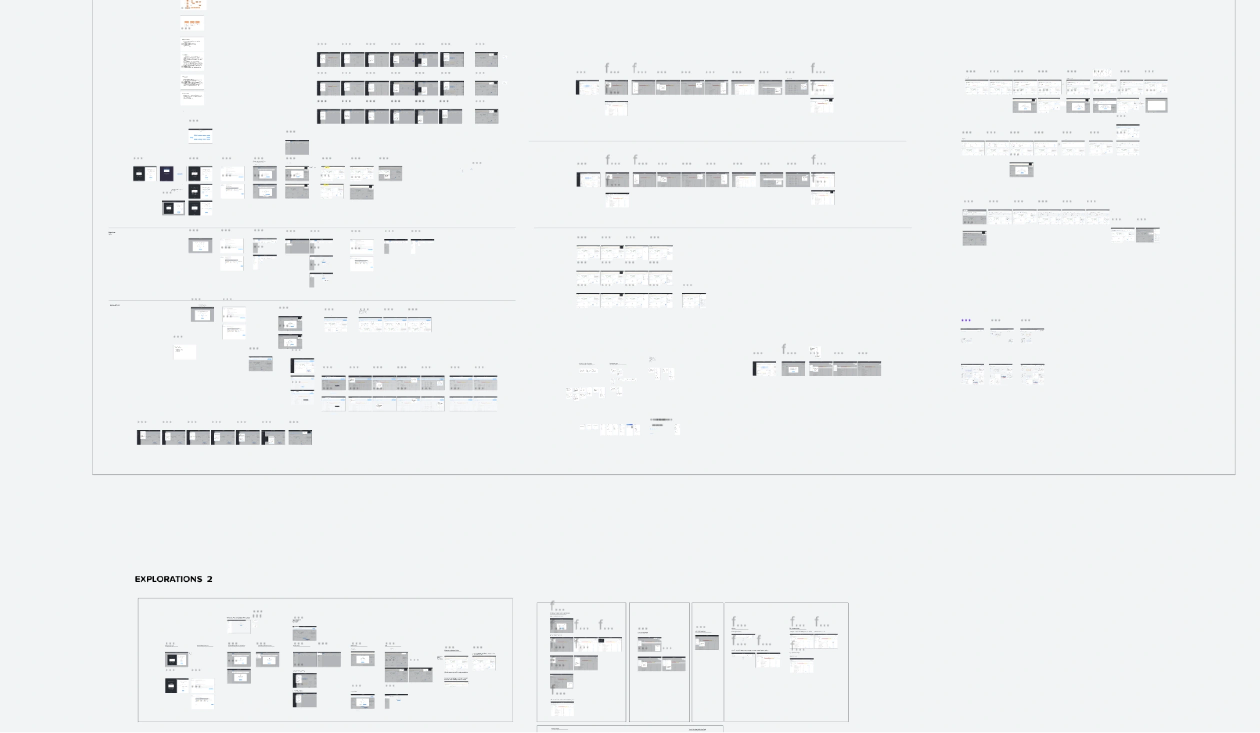
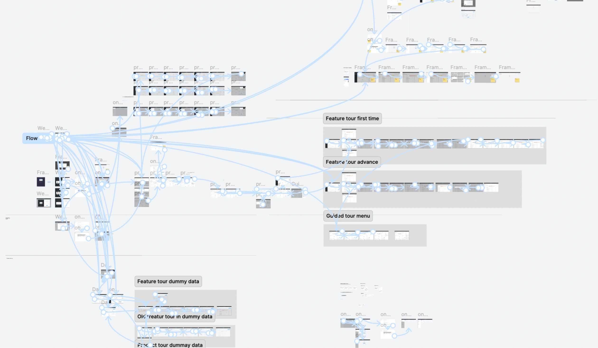
Figma prototype flow-connector map (Feature tour first time, Feature tour advance, Guided tour menu, Feature tour dummy data, Product tour dummy data)

Go to solution

Evaluation

Points identified in User testing

These were addressed in the following review sessions

Co-Creation Sessions

6 ๐Ÿ‘ค โฑ When: 2nd instance of prototype testing
  • Position flicker of options in product tour
  • Login screen and first screen is kinda same layout
  • User will be surprised to see hover in product overview link
  • Overlap of tool tips, with background screenshots
  • CTAs in tour with dummy data and real, might cause ambiguity
  • Emphasise of dummy data in dashboard is less
  • Change the ‘Onboard Resource’ copy, might be confusing to user
  • Repetition of Onboard success dialog box might make user think its consistent.
  • Motivation in the first screen is missing

Manager Reviews

4 ๐Ÿ‘ค โฑ When: 3rd instance of prototype testing
  • Set expectation on how long it will take resource to onboard completely, Users were raising request so its a big problem
  • Show the user what they can do next after onboarding in dashboard.
  • Advance user, accessing help.
  • Use of disabled screenshot in dummy tour, like old method seems efficient.
  • Data come in two types, network traffic and inventory info, check how data population occur

Evaluation with Ideal FTUE checklist

Evaluation of Onboarding cloud Resource

  • Where I landed
  • What I can do
  • Where I can go next
  • What value it gives
  • Clear navigation
  • Minimum effort
  • Engagement
  • Delightful
  • Progressive disclosure
  • Control to the user
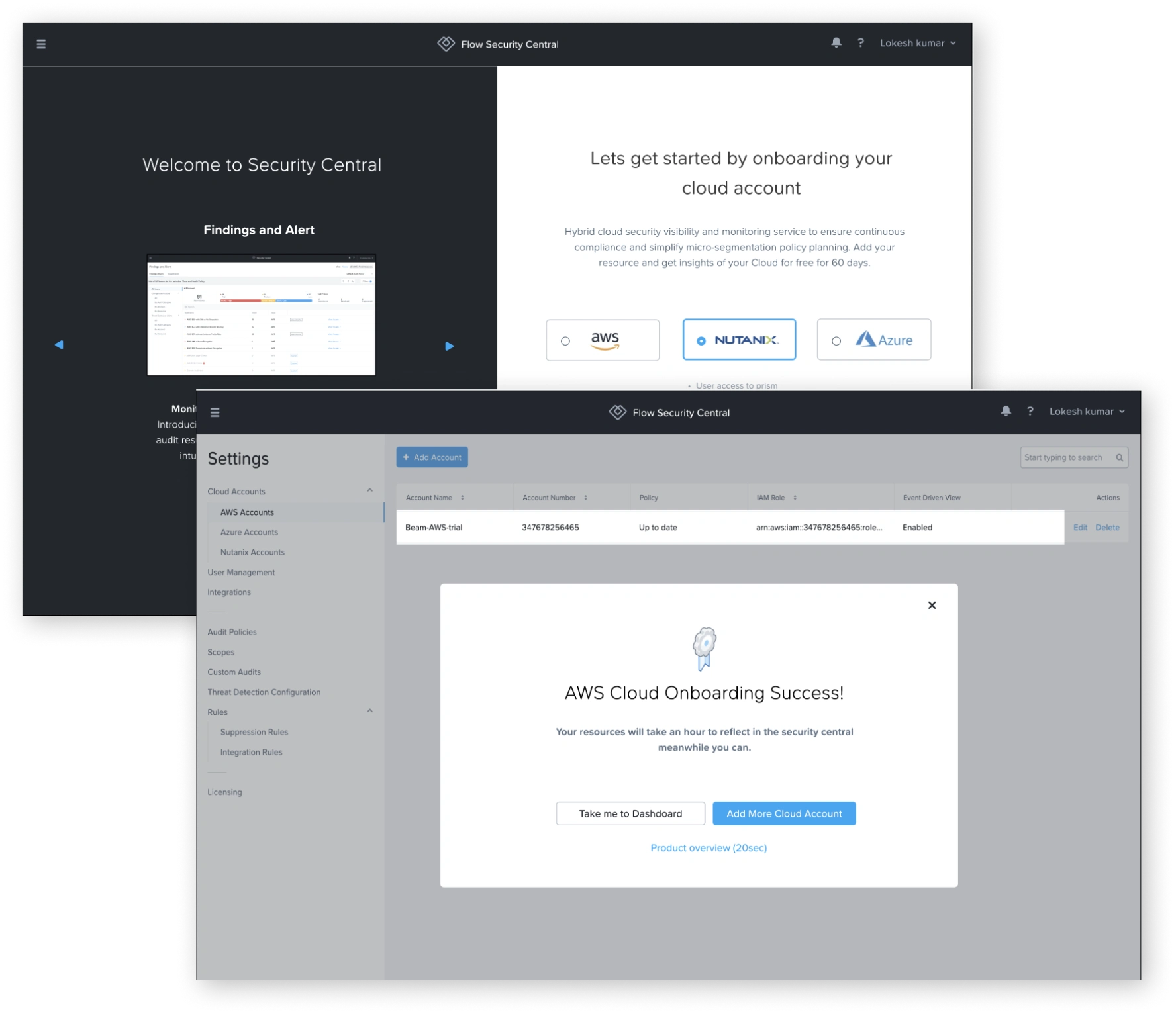
"Welcome to Security Central" onboarding + "AWS Cloud Onboarding Success!" dialog screenshots

Evaluation of Dashboard

  • Where I landed
  • What I can do
  • Where I can go next
  • What value it gives
  • Clear navigation
  • Minimum effort
  • Engagement
  • Delightful
  • Progressive disclosure
  • Control to the user
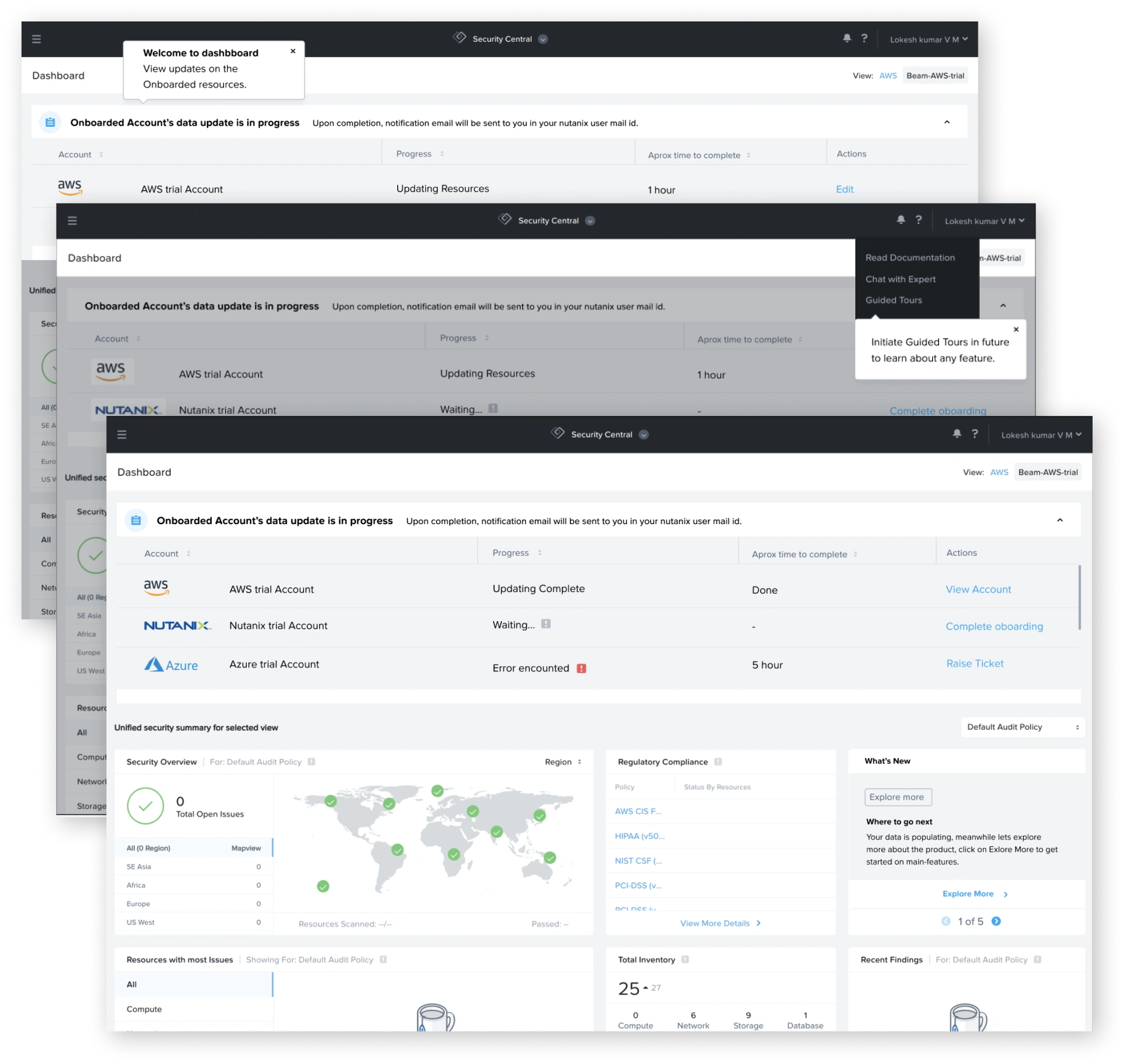
Dashboard screenshots with onboarding progress banner (updating / complete states)

During Tours

  • Where I landed
  • What I can do
  • Where I can go next
  • What value it gives
  • Clear navigation
  • Minimum effort
  • Engagement
  • Delightful
  • Progressive disclosure
  • Control to the user
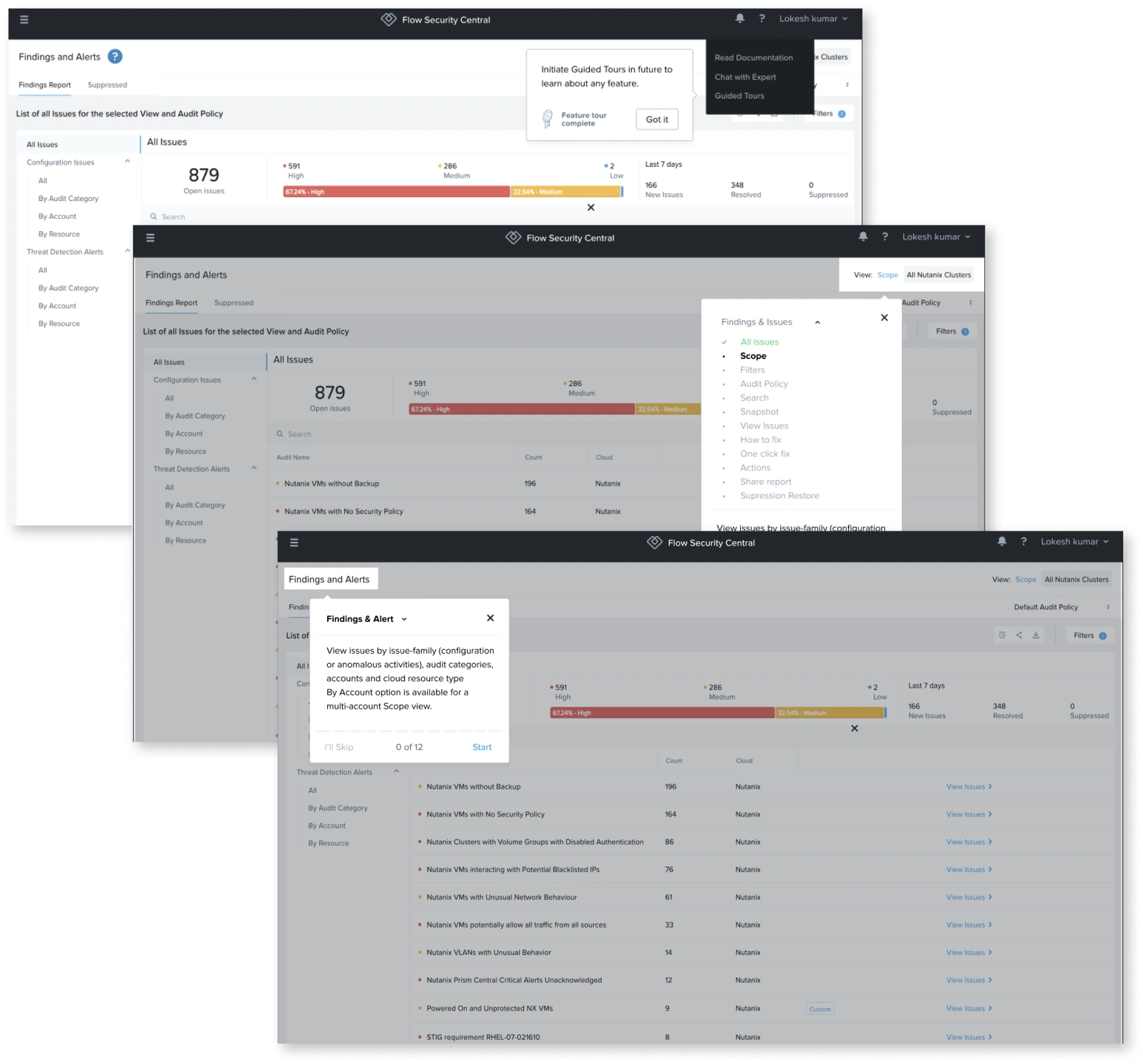
"Findings and Alerts" screen with guided tour tooltip screenshots

Thankyou