FTUE in “Flow Security Central”
Redesigning the first-time user experience of a B2B SaaS security product.
- Role
- Intern: research, design & testing
- Team
- Me, UX designer, PM & DM
- Timeline
- May – July 2021 (2.8 months)
- Product
- Cloud security management
Lokesh Kumar V MNutanix · Flow Security Central
Impact at a glance
Fixing the bottlenecks in onboarding cloud resources
Initial client tickets dropped by 30%, and removing the onboarding bottlenecks helped product adoption.
Quick context
Why
- Get new users to an “aha” moment quickly
- Help users see value early, adopt the product and keep using it
What
- A first-time user experience overhaul
- Day 0–2 & Day N guided journeys
Who
- IT security & virtual infrastructure admins
- Trial and first-time users
- Users discovering advanced capabilities
How
- A scalable onboarding framework
- Progressive disclosure and guided flows
- Modular UI components
The product
Flow Security Central
Automates Cloud Security Posture Management (CSPM) across multi-cloud infrastructure.
- Compliance status
- Creating custom audits
- Security planning
- Inventory view
Design brief
“Reimagine the first-time user experience for Flow Security Central so new users can quickly realise the product’s value.”
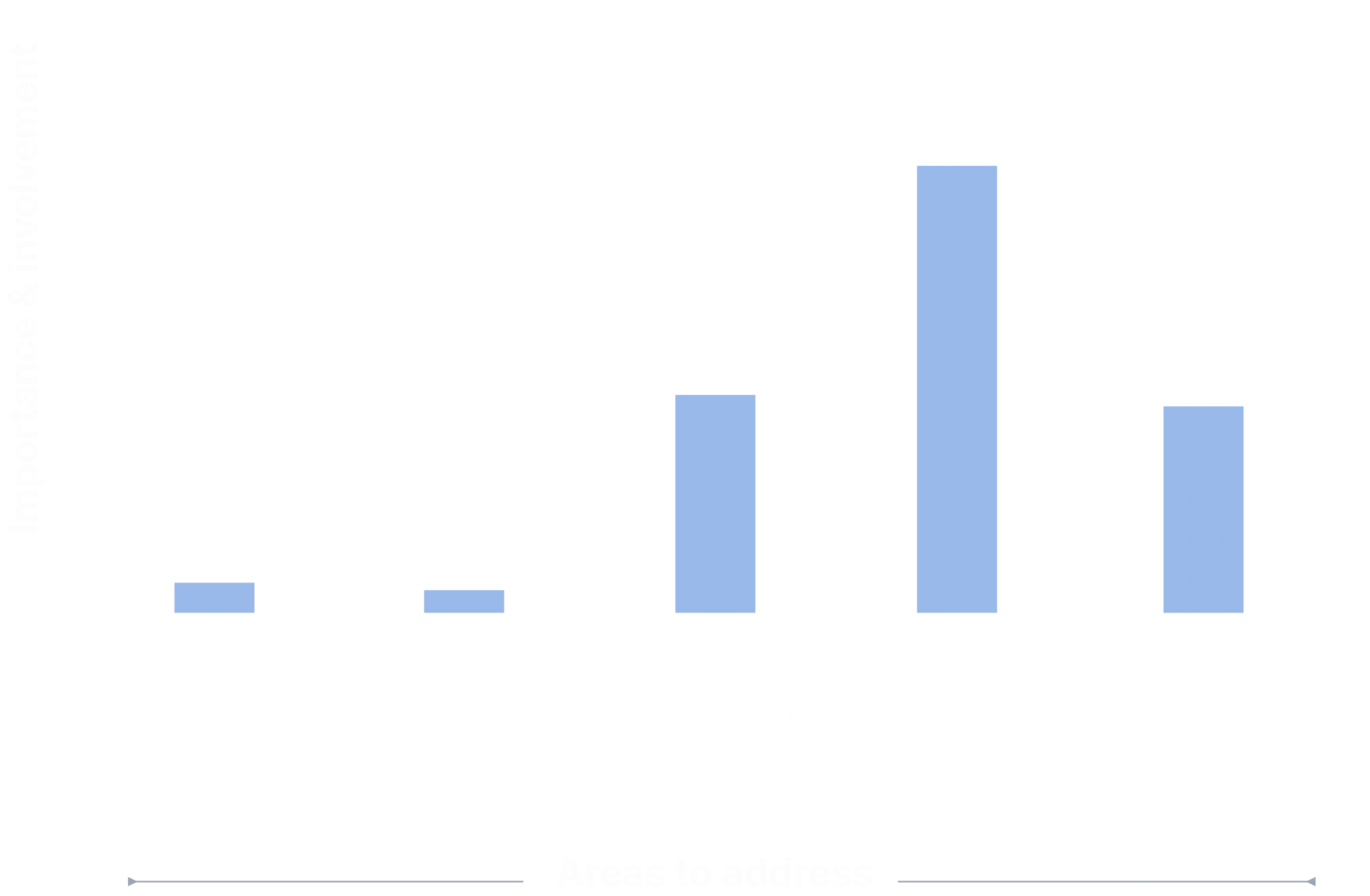
Scope: importance & involvement by area
Why do this?
Reduce the initial drop-off rate
Overhaul a friction-heavy legacy onboarding
Support a relatively new product line at Nutanix
Show product value, with or without live data
Before
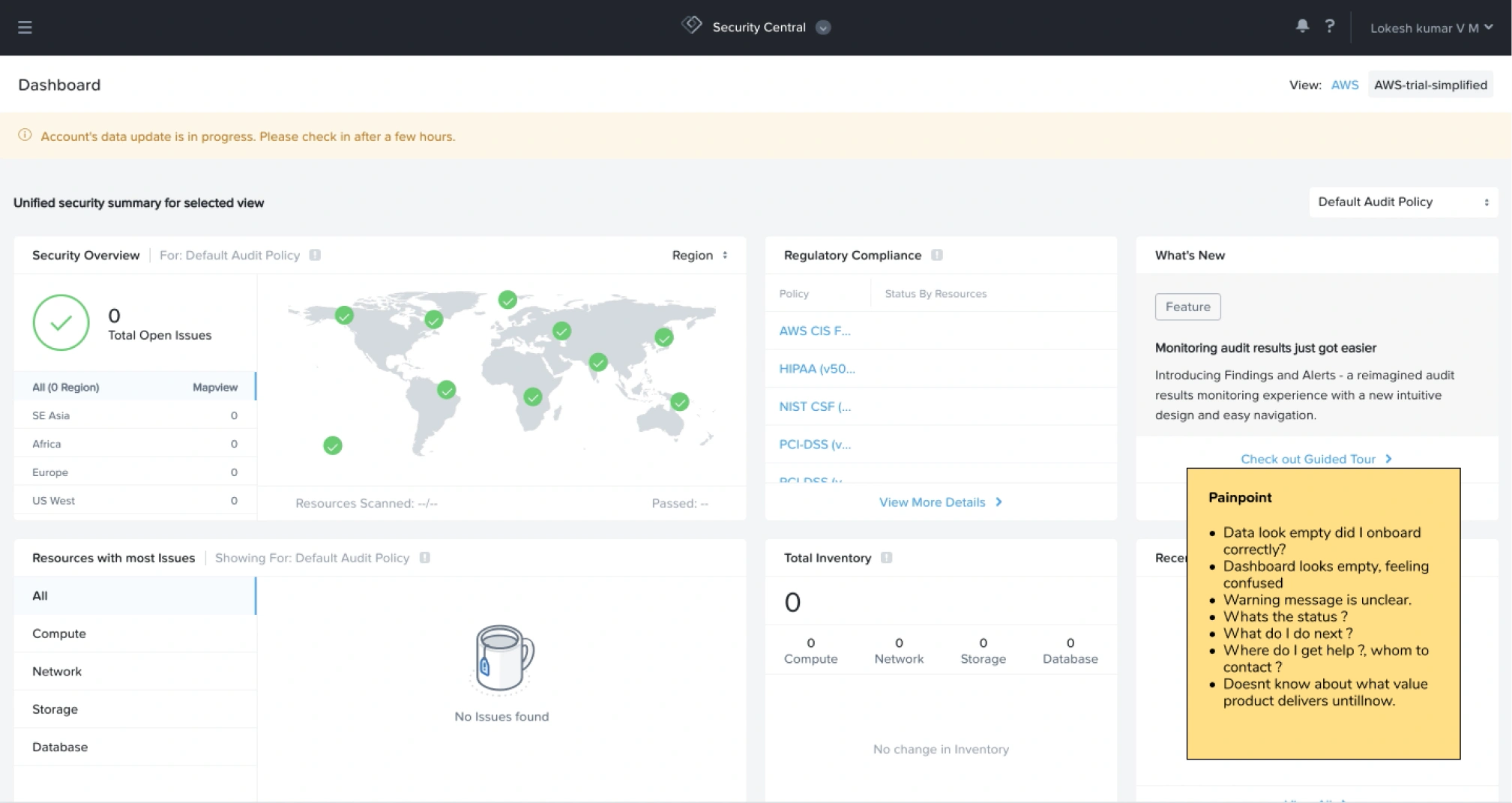
The old first-time experience
First-time use
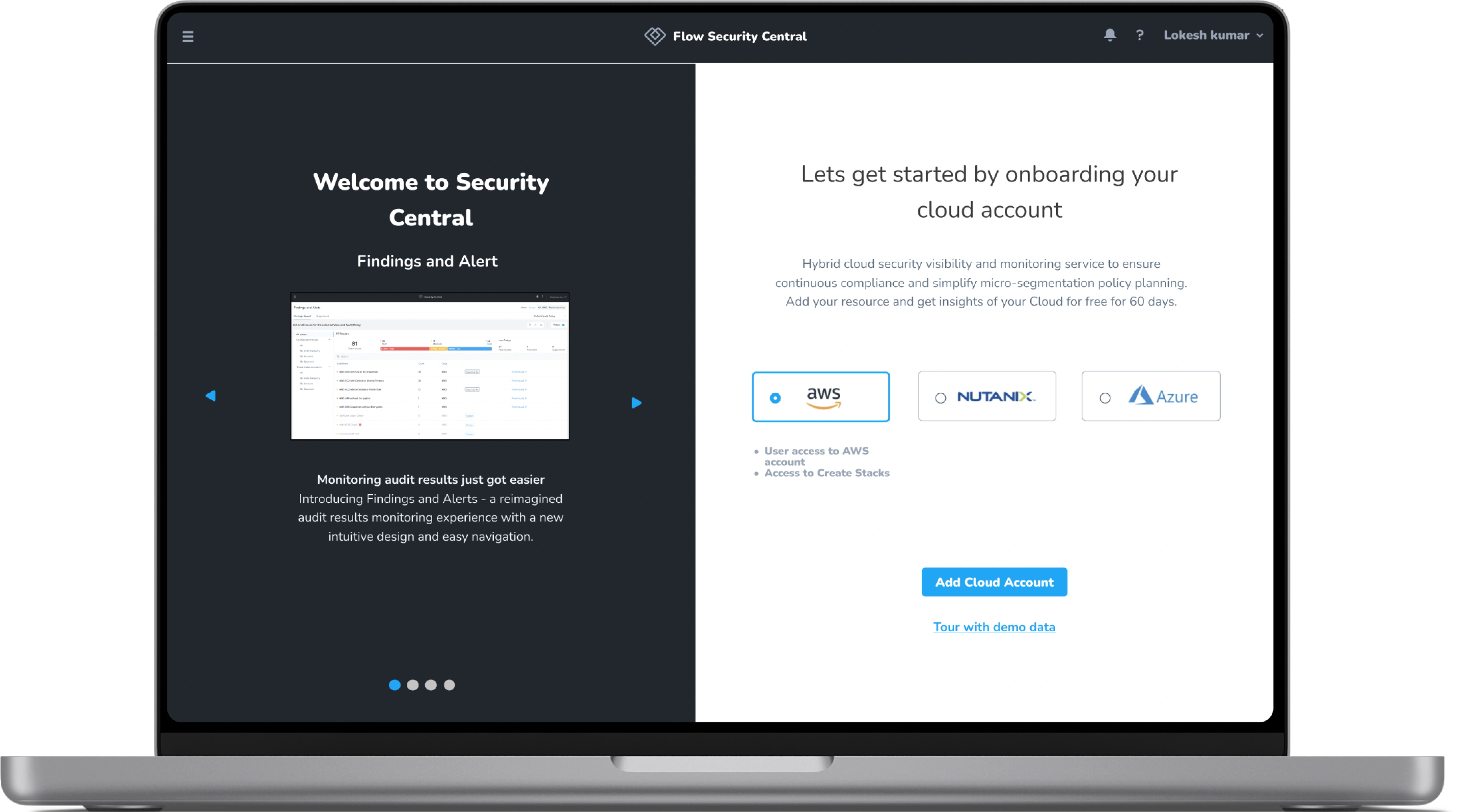
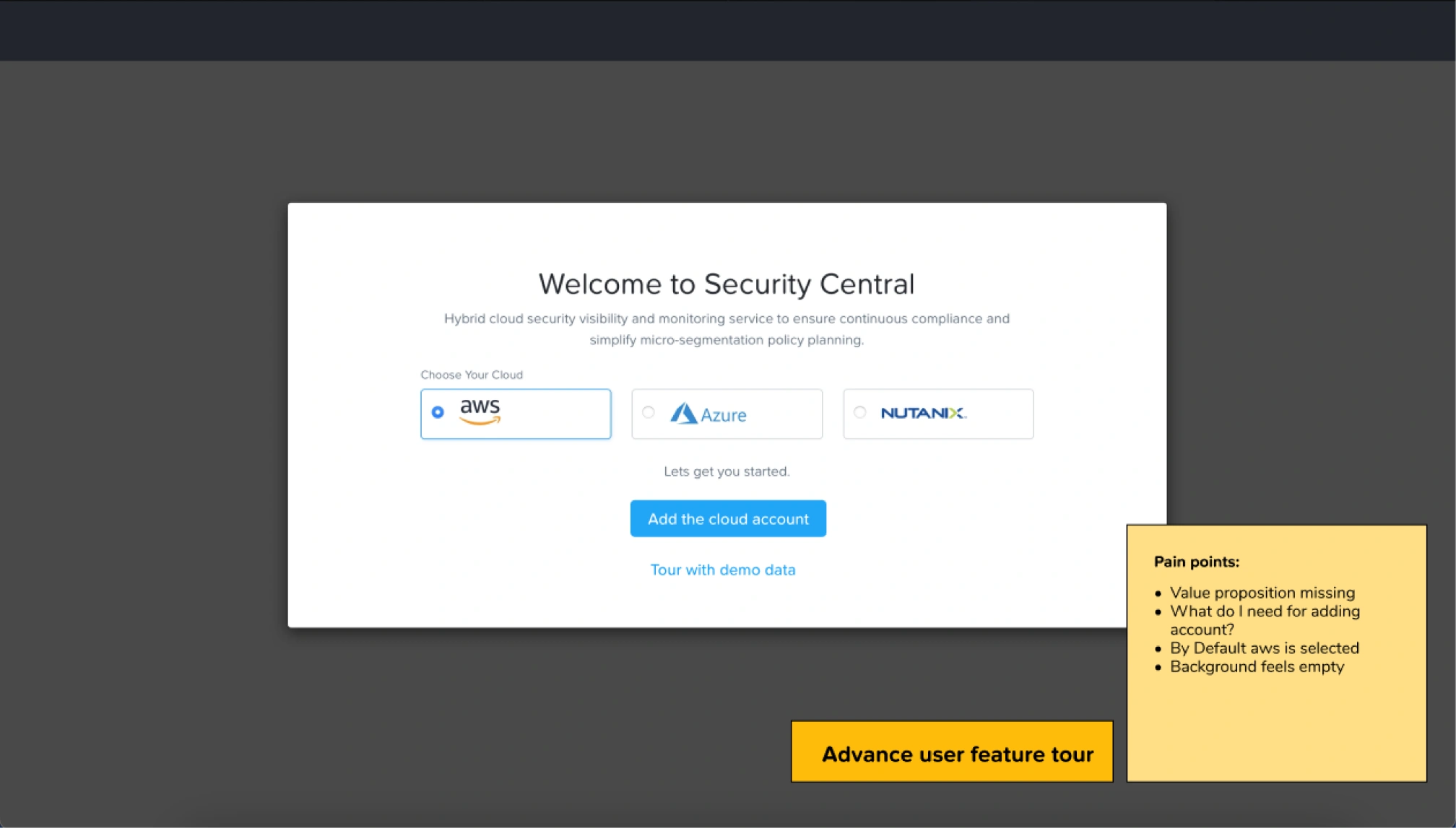
- No value proposition on the welcome page
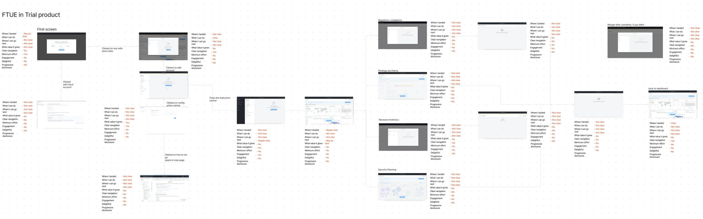
- No clear flow: every path ends at resource onboarding
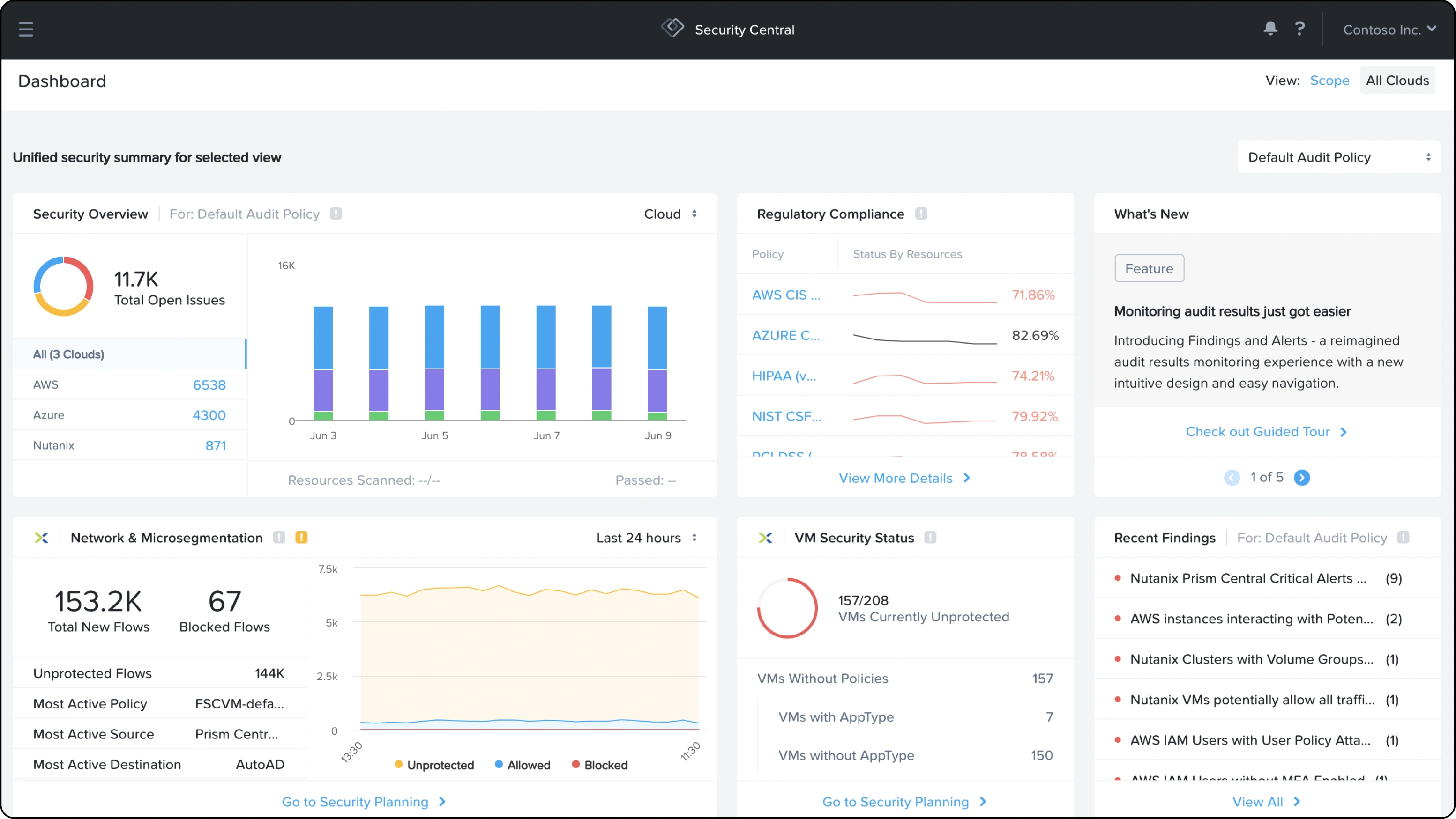
- Blank pages, and a dashboard that’s hard to find
Guided tours
- A 13-step walkthrough with no progress indicator
- The tour takes full control; skip and close are hard to find
- An abrupt ending that leads nowhere
Who it’s for
IT security & virtual infrastructure admins
Alex · 35 · Security analyst · Tech-savvy, compliance-focused, runs hybrid cloud
Three types of user, three different needs
Exploring without any cloud resources
- Understand what onboarding a cloud resource needs
- See the product’s value with dummy data
- Feel motivated to onboard a resource
Cloud resources ready to upload
- Why and how to onboard a resource
- Where to go next after linking it
- Handling the wait while it onboards
- Learning the product
Exploring features on day N
- Discovering new additions
- Coping with long tours
- Jumping to a specific step in a tour
The solution
The solution in three parts
1 · Order of unfolding
The order in which features are shown to the user, set by value analysis
2 · Supporting UI components
Tooltips, milestones and guided tours built on the Nutanix design system
3 · The onboarding flow
The full journey for users with or without data, and for advanced users
Solution 1 · Order of unfolding
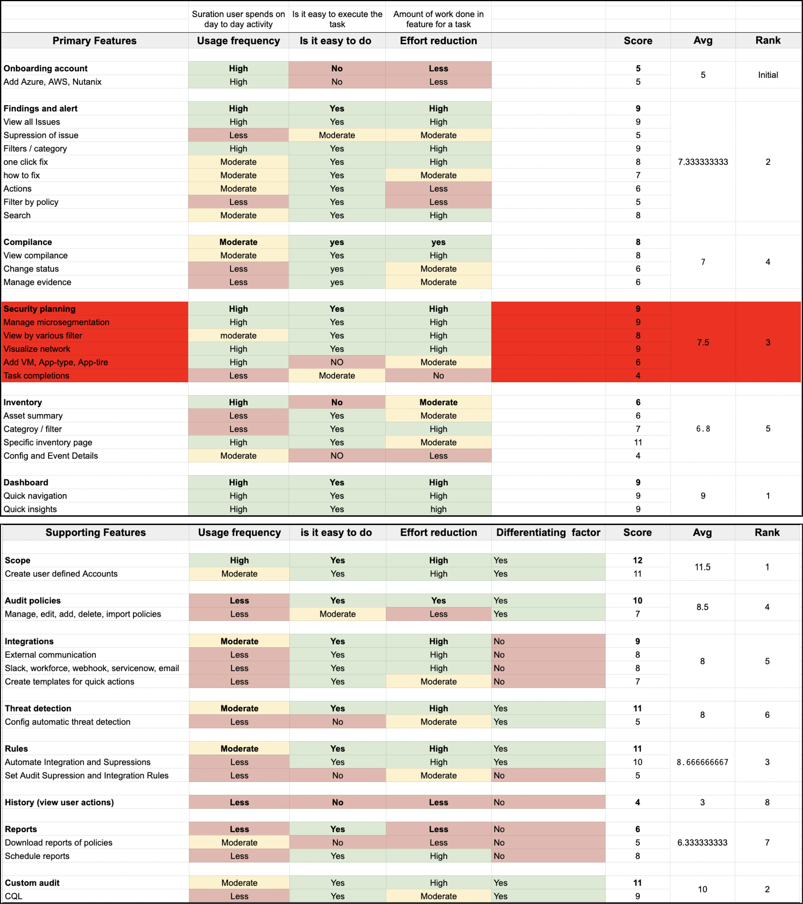
Which feature to show first? A value analysis
I ranked every feature on three criteria with a weighted matrix, and did the same for supporting features.
Ease of task execution
Effort reduction
Usage frequency
Resulting order: primary features
- Onboard a cloud resource
- Dashboard
- Findings & alerts
- Inventory
- Compliance
- Security planning
Then, optional
Scope, custom audits, rules, audit policy, integrations, threat detection, reports, history
Solution 2 · Supporting UI components
Information tooltips and milestone moments
Basic information tooltips, with variants for milestone completion and visual guides on actions, all within the existing Nutanix design system.
Solution 2 · Supporting UI components
A guided tour that shows progress
Progress is clear both visually and as a number. The old tour had no progress indicator at all.
Solution 2 · Supporting UI components
A dynamic tour you can jump around in
Users can skip ahead in long tours and go straight to what they need. It also surfaces new features.
Solution 3 · Onboarding flow
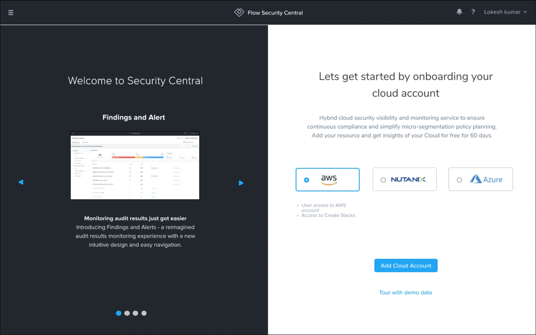
The welcome screen, before and after
Before
After
Solution 3 · Onboarding flow
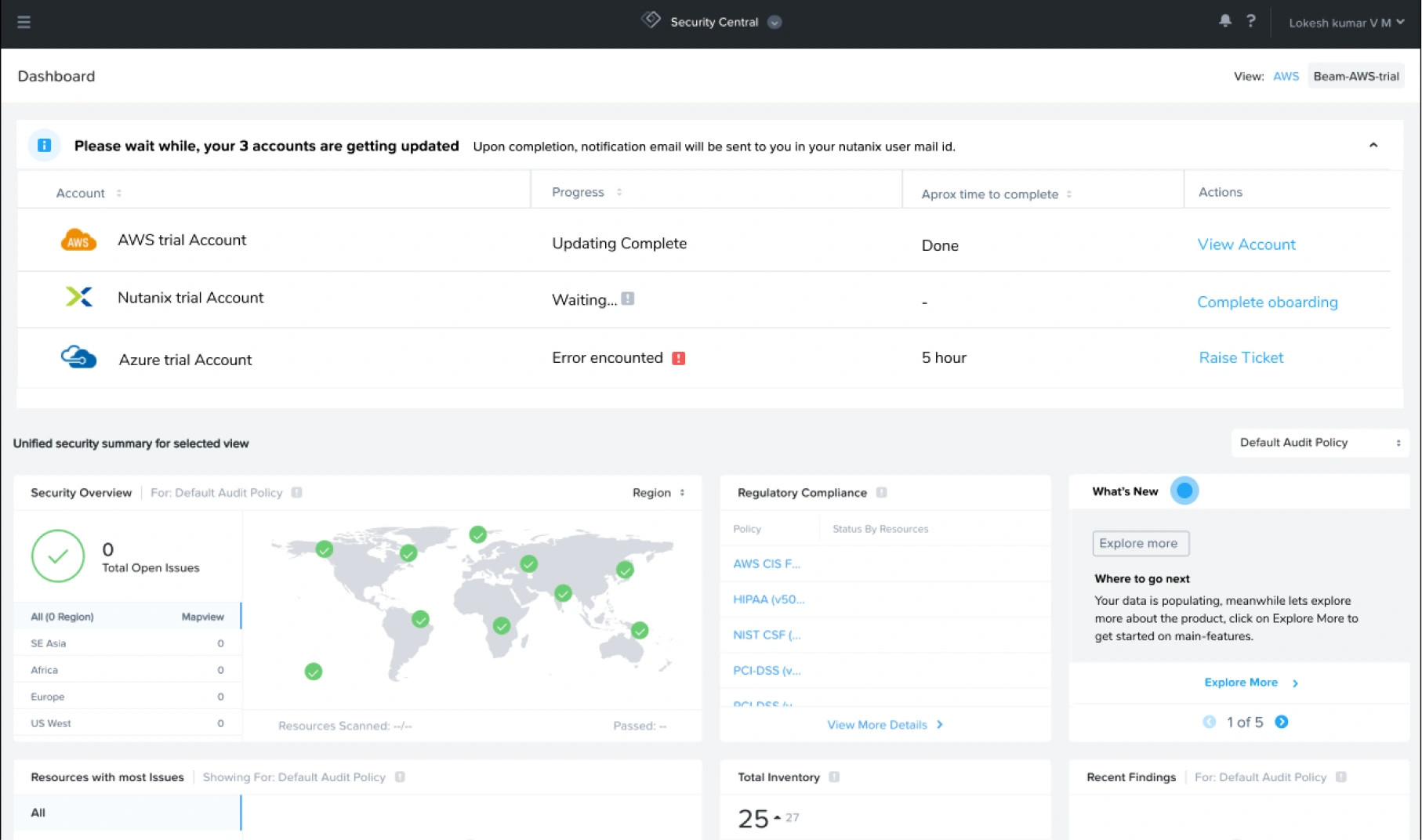
The dashboard, before and after
Before
After
Solution 3 · Onboarding flow
A collapsible pane for resources still onboarding
When a user onboards a cloud resource, this pane appears on the dashboard, collapsed, so they can track its progress while they explore.
After
The redesigned experience
Process
How I got there
- ResearchWalkMe videos, PM and SME conversations
- Pre-product experienceWhat users meet before they sign in
- Studying the productFeatures, tasks and the current flows
- Competitor analysis15 products checked against FTUE frameworks
- Defining must-havesAn ideal FTUE framework and a checklist
- Persona & needsWho we designed for, and what mattered most
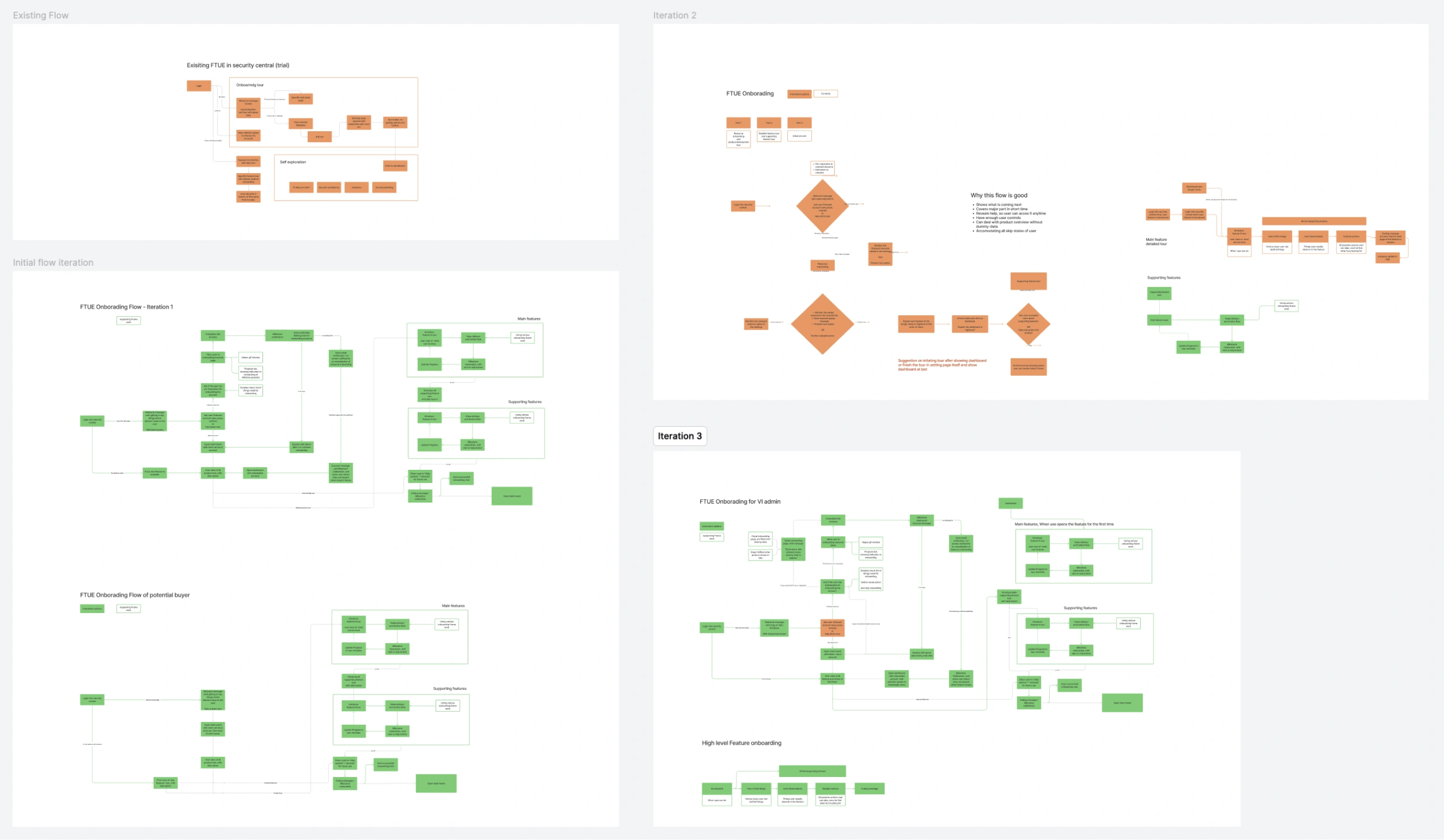
- IterationsOnboarding flows, top to bottom
- Wireframes & prototypesTested in several rounds
- EvaluationCo-creation sessions, manager reviews, checklist
Research
I studied user flows from WalkMe videos and conversations with the PM and subject-matter experts.
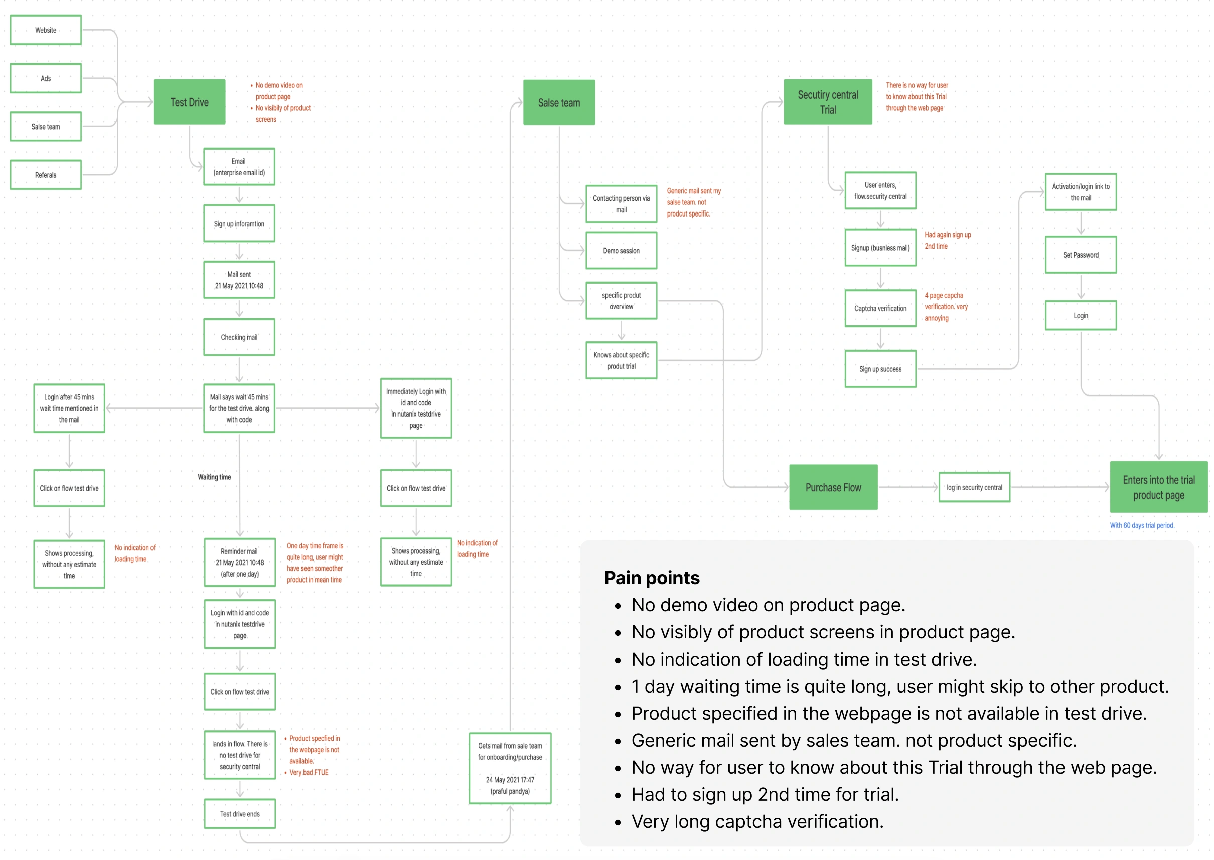
Studying how users move through the product
Before users even enter the product
What competitors show on their product pages
Pain points in the journey to the product
Studying the product
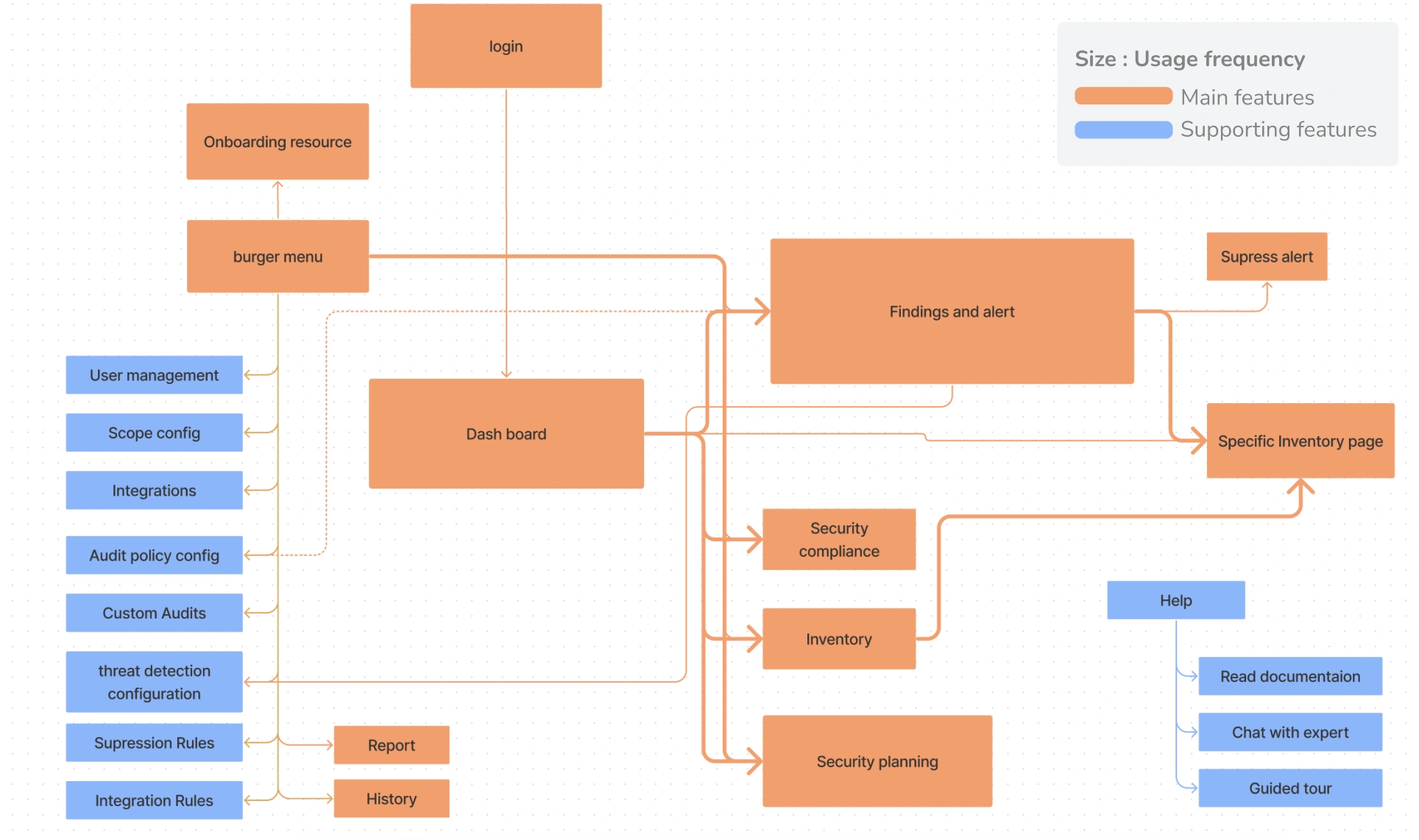
Most used, main features
Dashboard, findings & alerts, compliance, inventory, security planning
Less used features
Scope, custom audits, audit policy, user management, add accounts, integration rules, suppression rules, threat detection
Analysing the current experience
I evaluated every screen of the existing experience against a checklist I prepared.
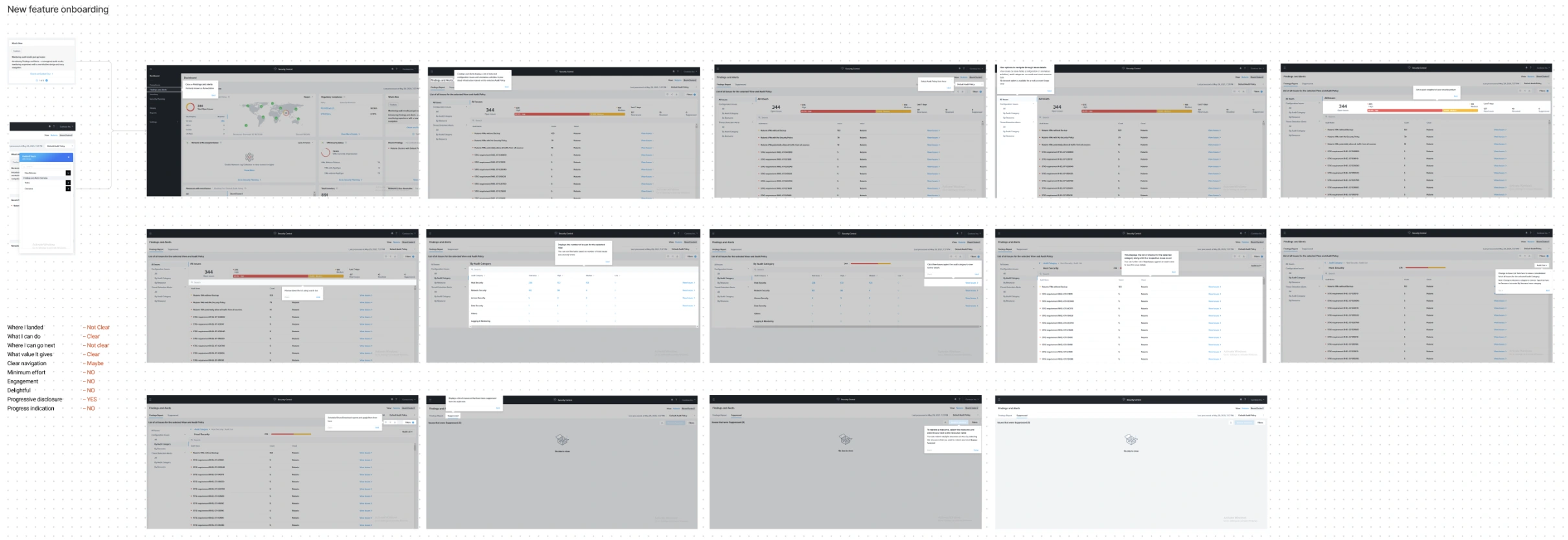
Competitor analysis
Every FTUE framework I read covers three things. I checked 15 products against them, most picked from articles on onboarding best practice.
1. Strategies
Help, contextual onboarding, progressive disclosure, assistance-based onboarding, degree of user control, documentation & support
2. Order of unfolding
A user-value-based flow, a function-based flow, or a feature-based flow
3. UI elements
Sign-up, welcome message, product tours, progress bar, checklists, hotspots, action-driven tooltips, milestone celebration, in-app & out-of-app connection, ending message
Enterprise products (8)
Robin, Ninox, Mailchimp, IBM Cognos, Salesflare, Productboard, Userpilot, FullStory
Consumer products (4)
Grammarly, StoryChief, Evernote, Typeform
Mixed products (3)
Conversion XL, Box Starter, Slack
Comparing the strategies side by side

Click to enlarge
What the competitors taught me
Tour initiation
Skippable tours, a gist of the contents, mock images to explain features
Advanced use
Access to help, jumping to a point in a tour, learnable new features
Attention grabbers
Animated point and label hotspots, with the right colour and contrast
Information delivery
Context-based tooltips; progress, back, skip and next controls
Encouragement
Subtle celebrations using image and text increase engagement
Help initiation
A visible floating icon, and tours you can start any time
Ending directions
A short sum-up, a celebration, and where to go next
Defining the must-haves
What the research showed
- Show users what they can do and what to expect
- Deliver value as soon as possible, with minimum effort
- Make things clear, visible and easy to learn
- Encourage users to investigate the options
- Give users a reason to come back
The checklist I held my design to
✓ Where I landed
✓ Minimum effort
✓ What I can do
✓ Engagement
✓ Where I can go next
✓ Delightful
✓ What value it gives
✓ Progressive disclosure
✓ Clear navigation
✓ Control to the user
The ideal FTUE framework
Where am I
No doubt this is the starting point
What I can do
The things possible in the product
Where I can go
Make the next step apparent
Navigation
A clear, visible, logical structure
Value first
How it makes their lives better
No explanation
Let users do, don’t instruct
Progressive disclosure
A taste first; discover more naturally
No friction
Common patterns and a flawless flow
Engagement
Keep users active, never bored
Trust
Care with permissions and sensitive data
Delightful moments
Celebrations, micro-interactions, animated loaders or smart copy
User persona
Alex, VI & IT security admin
35 · 10+ years in IT infrastructure and cybersecurity · Bangalore · Uses CloudHealth, Prisma Cloud, CloudCheckr
Goals
- Ensure compliance across on-premises and cloud resources
- Real-time visibility into the security posture
- Keep cloud resources in good health
Pain points
- Scaling security across hybrid cloud environments
- Finding and fixing vulnerabilities efficiently
- Balancing efficiency with strict compliance
Qualities
- Tech-savvy, often switching between dashboards
- Prefers streamlined tools with actionable insights
- Relies on reports for audits and stakeholders
Wants
- One dashboard for multi-cloud security
- Automated vulnerability detection and remediation
- Real-time compliance tracking and easy reports
The major user needs
Show the product’s value as soon as possible
Handle the wait time and errors after linking a cloud
Motivate users to onboard cloud resources
Clear navigation, and access to help
For first-time use
- Redesign the end-to-end user flow
- Where to go next once a cloud resource is onboarded
- Handle the waiting time of onboarded resources
- Show value with dummy data, and introduce every feature
For advanced use
- Access to help
- Jump between tours to a specific point
- Visibility and learnability of new features
Iterating on the onboarding flow
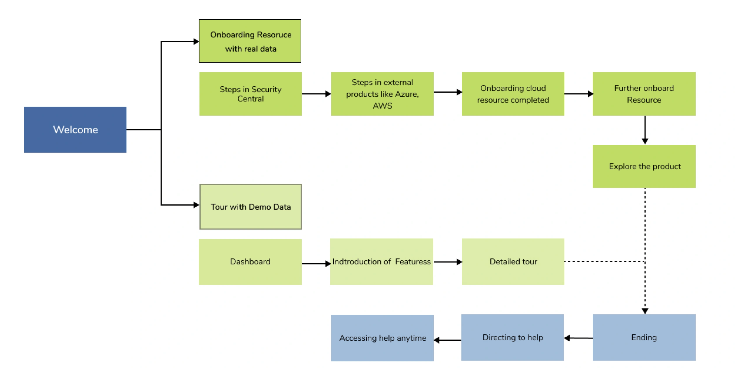
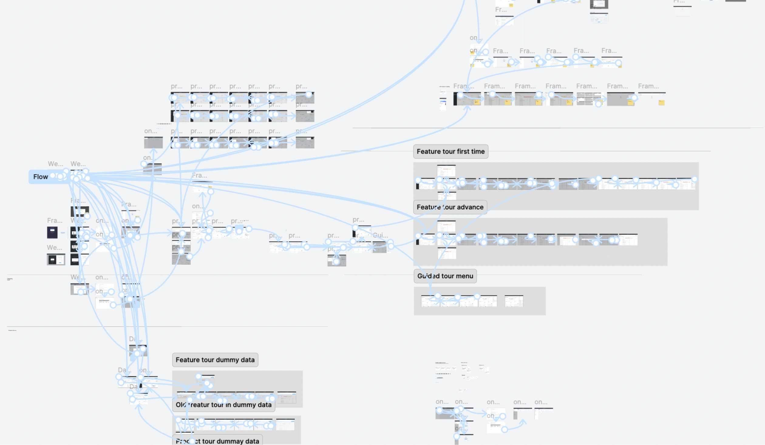
The top-level flow, and the needs behind each step
Top-level onboarding flow
User needs, challenges and possible solutions per step
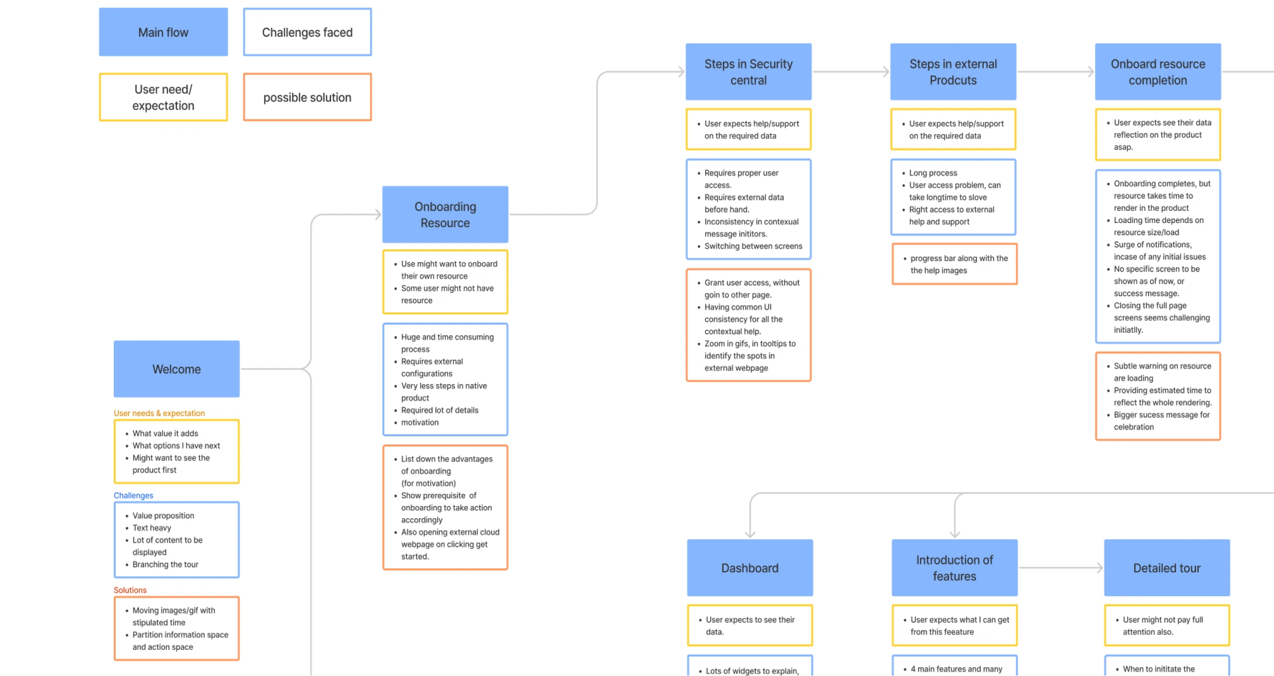
Click either diagram to enlarge
Wireframes, then prototype testing
Low-fidelity wireframes
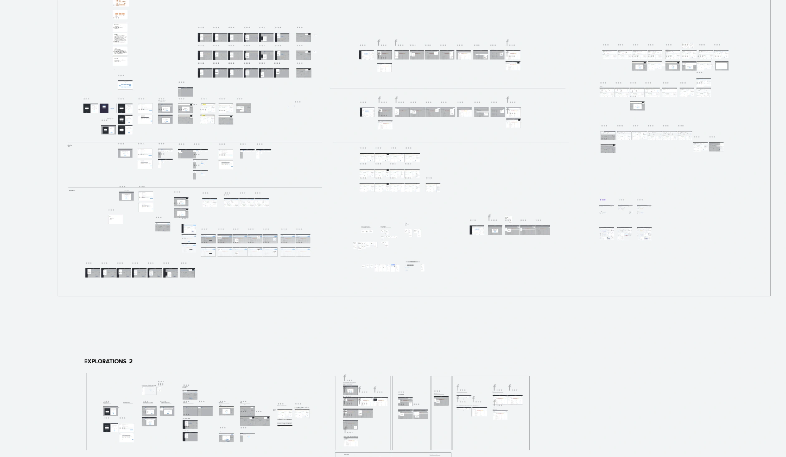
Prototypes used in testing
What testing surfaced
Co-creation sessions
- Options flickered position during the product tour
- The login and first screens looked almost the same
- Tooltips overlapped the background screenshots
- Dummy-data and real-data tour CTAs could be confused
- The first screen lacked motivation
Manager reviews
- Set expectations for how long a resource takes to onboard; users kept raising requests about it
- Show what to do next after onboarding, on the dashboard
- Give advanced users access to help
- Check how network traffic and inventory data each populate
Evaluating the design against the checklist
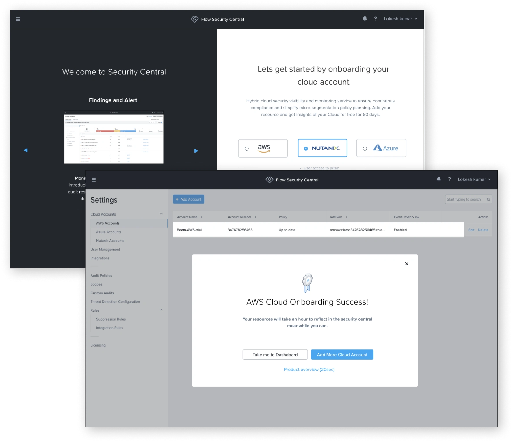
Onboarding a cloud resource
8 of 10 checks met. Still open: progressive disclosure, control to the user.
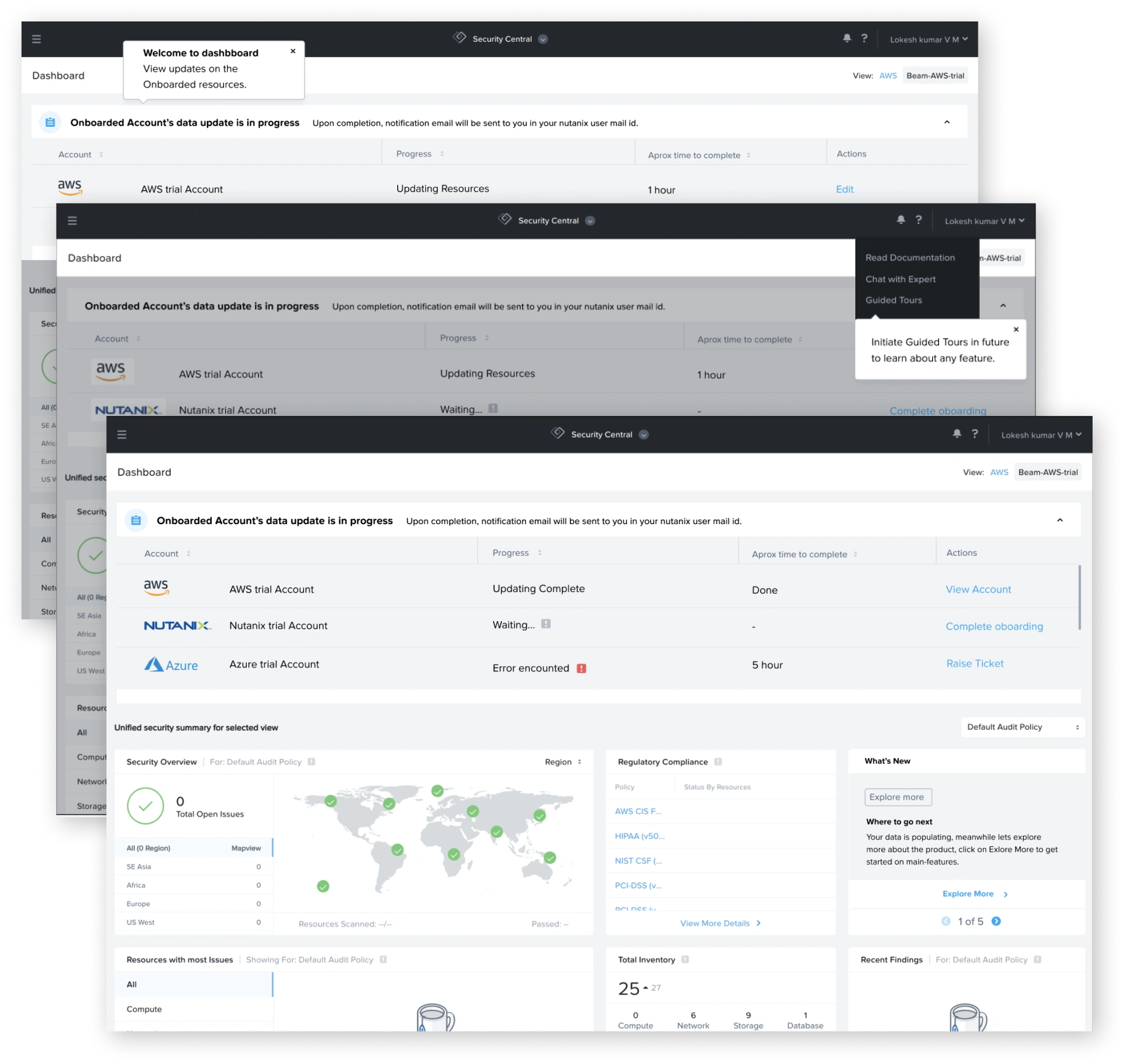
Dashboard
9 of 10 checks met. Still open: progressive disclosure.
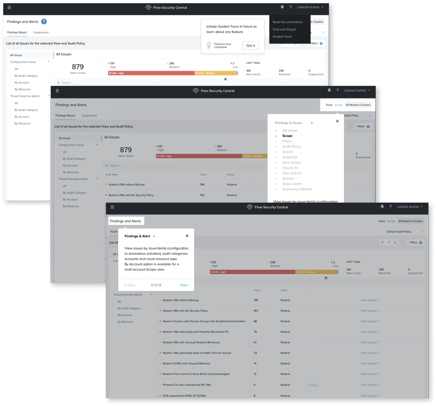
During tours
All 10 checks met.
Thank you
Questions?
Lokesh Kumar V M · Senior Product Designer · lokeshdesign.com